Multiple Vignette Techniques in Aperture 3
The vignette is a common and simple technique to add to any photo. It burns (darkens) the edges around a photo, making the center appear brighter, and therefore draws the viewers attention to the center of the frame. Used subtly and well, your viewer is unlikely to notice the vignette. There are times however where a single vignette adjustment doesn't quite give you enough control. This is where Derrick's technique comes in.
The double vignette
First let's give credit where it's due… this technique came to me from Derrick Story of thedigitalstory.com, and he suggested that I expand on it. There's no need to duplicate what he's already said, as you can read all about that in his post, “The Double Vignette Technique in Aperture 3”. Derrick's focus is on using multiple Vignette adjustments to control the gradation of the effect.
 Click through to read Derrick’s original post on thedigitalstory.com
The heavy-handed single vignette
There are times to overcook the effect, making an obvious dark ring around the image, and that in itself can be an effective look as well—especially when trying to mimic a look of older cameras with wide lenses, where a vignette was just a fact of life. Or a very heavy vignette can be used to obscure pretty much all distracting content around the edges of your scene. In the examples below, you can see a vignette applied to the extreme. In fact the Aperture Vignette “Intensity” adjustment is set to 5.15, done by click-dragging on the numbers themselves (the slider only goes to 1.0!). This look was achieved with a single Vignette adjustment.
 Intensity is way past the slider’s limit
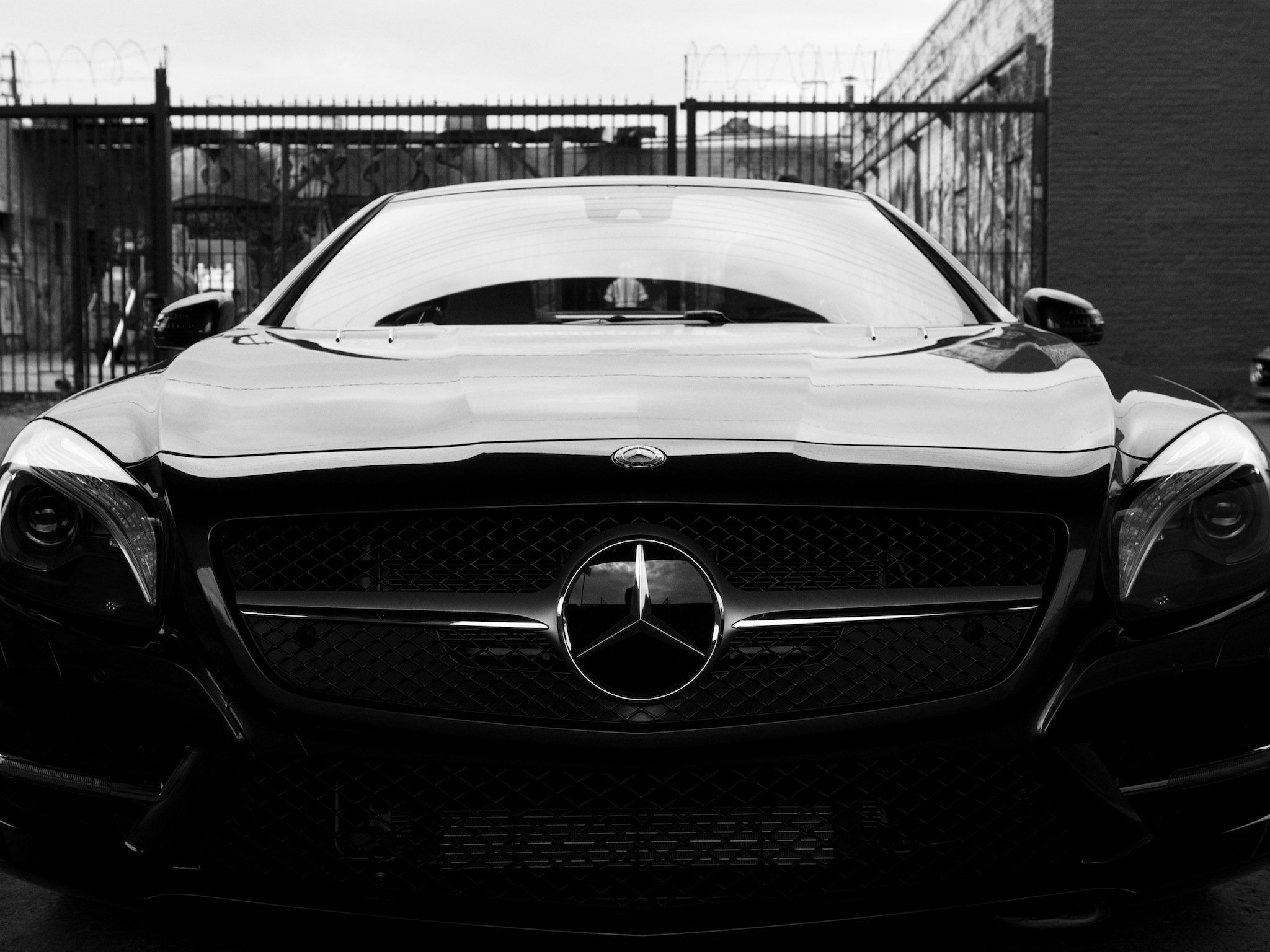 The photo with no vignette applied
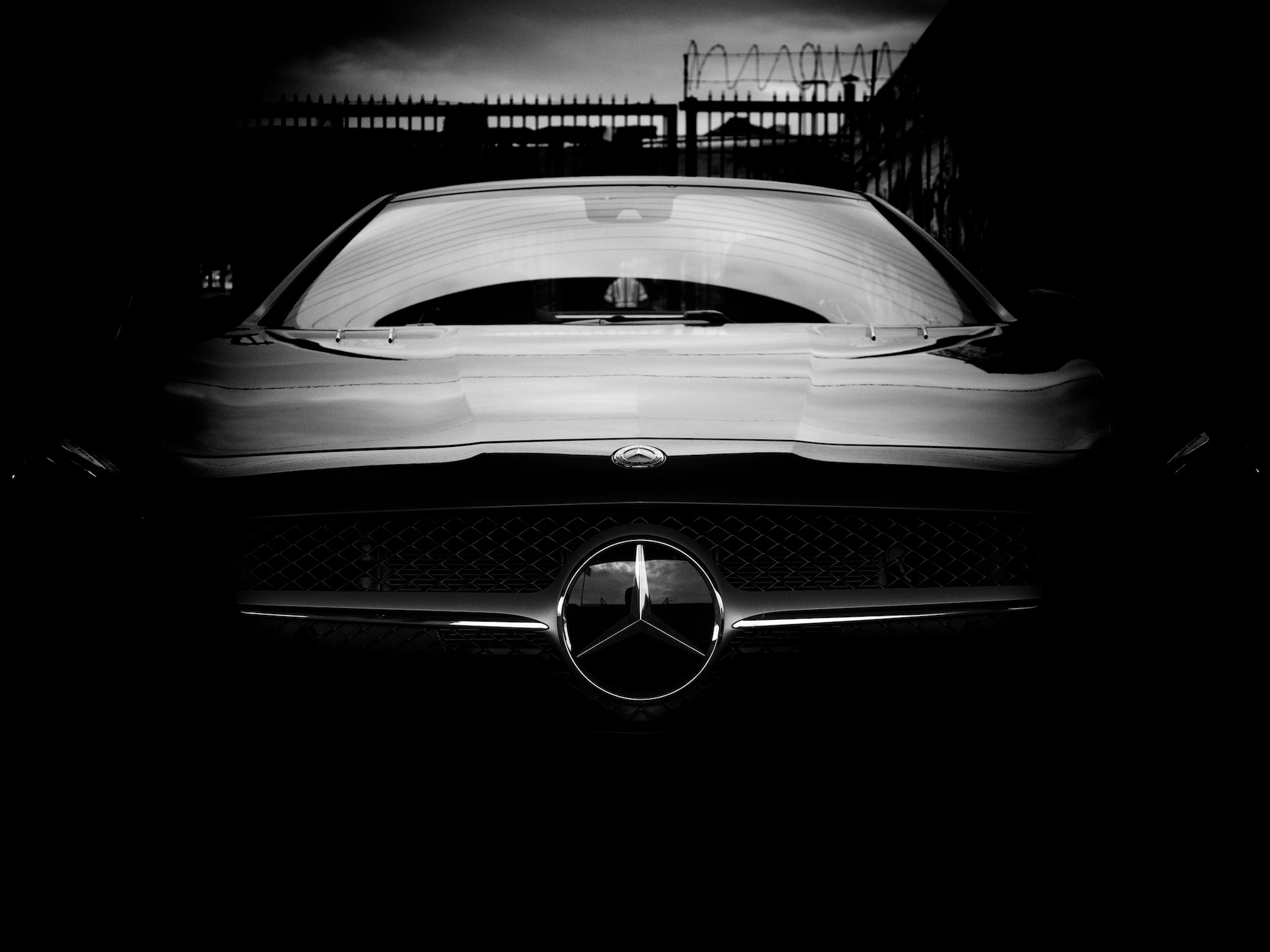 The same photo with a massive vignette applied
The brushed multiple vignette
Another application for using multiple vignettes is when you need a different intensity on one part of the image over another. In Aperture, you can't control the center point nor the shape of the vignette, nor can you make the intensity on one side different than another. However what you can do is apply multiple Vignette adjustments, brushing them in and out to achieve the look you want. This can come in especially handy on a wide crop, where a circular vignette simply can't touch the top and bottom without obliterating the sides.
In this first photo, the sky is vignetted the way I want it, but the sides of the image are clearly way too intense. The cars on the edges are almost completely hidden!
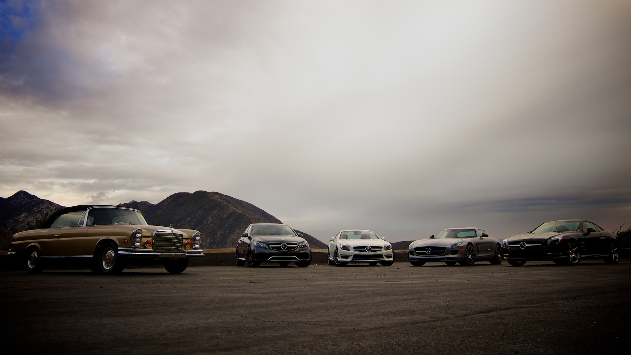 The vignette applied here is completely hiding the Mercedes-Benz cars on the sides, but the sky looks pretty good
The easy solution is to just brush away the effect on the sides. Click on the gear menu and choose “Brush vignette away”.
 It’s easy to brush the unwanted part of your vignette away
Here's a screenshot of the effect brushed out, followed by the image itself. In the screenshot, the red overlay shows where the vignette is applied, and where it's not red, the vignette has been brushed away. Notice that I didn't have to actually follow the curve of the vignette—all that matters here is that the vignette is removed from the bottom half, and if you look closely, you'll see that it's gradually faded up around the sides to ease the transition from vignetted to non-vignetted.
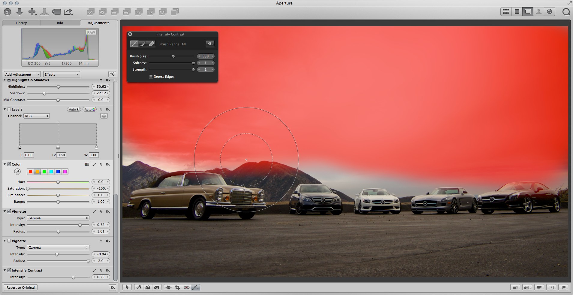 This screenshot shows the vignette being brushed out of the bottom half of the image
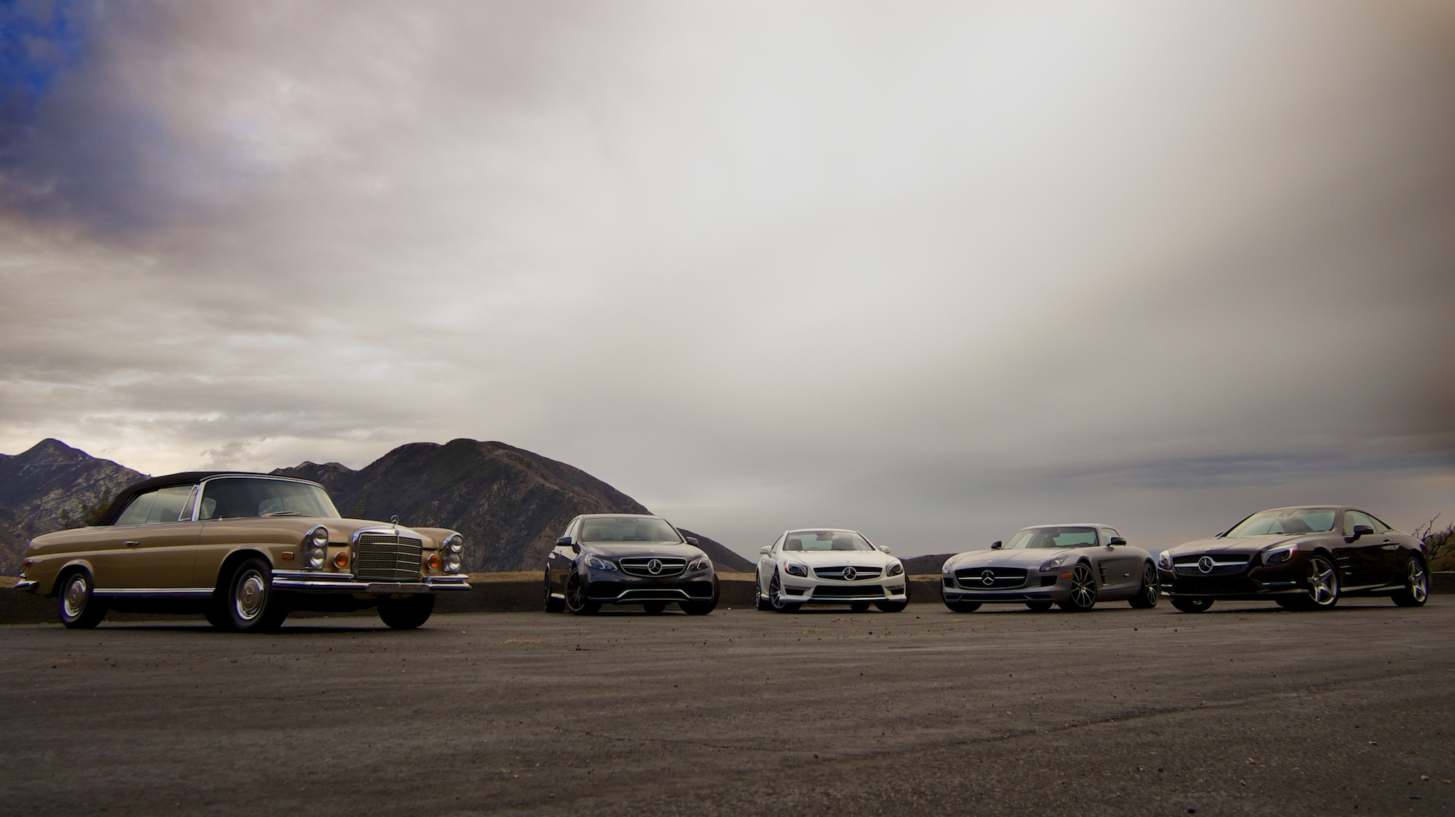 This version of the photo has the vignette applied only on the top half of the scene
However this image isn't complete, because it does still need a little vignetting on the bottom half—just not as much as on the top. So, all you need to do is add another Vignette adjustment by choosing “Add New Vignette adjustment” from the gear menu, adjust that to taste, and brush it in where you want.
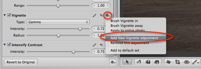 Click on the gear menu and choose “Add New Vignette adjustment” to add another vignette to your image, which you can also brush in and out
Here's a version of the photo with two Vignette adjustments applied, with different intensities on top and bottom, each brushed into the necessary areas.
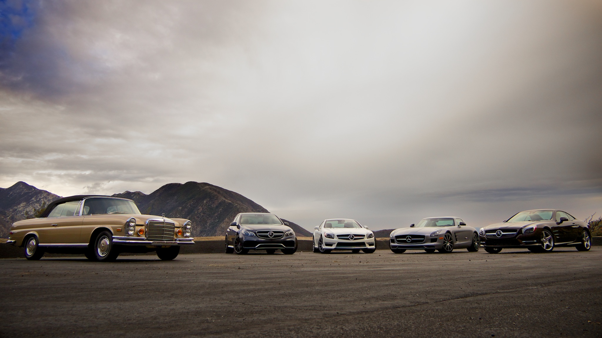 This version has a two Vignette adjustments, one on the top and another on the bottom, and the cars have had a Dodge brush applied to brighten them up a little

Comments
on December 5, 2013 - 4:47pm
Great post, nicely illustrated. I’ve been brushing vignettes for a while, but had never thought of using multiple bricks. Thanks for sharing!
jacquescornell.com
on December 5, 2013 - 9:21pm
I never realized I could fade out part of a vignette nor did I see the advantage of using more than one brick. Thank for the wake up post.
Greetz, Martin
on December 6, 2013 - 12:13am
Nice. Very nice.
on December 10, 2013 - 1:02am
I saw Derrick’s original post and tried the technique out, which is very useful. This post puts icing on the cake. Thanks.
Andrew Macnaughton
on December 15, 2013 - 6:22am
Great idea! Thanks!