[00:00:00.00] Hi I'm PhotoJoseph. Recently DxO asked me to join them on their virtual press tour for the launch of DxO PhotoLab 4. I gave a demo of the new features in PhotoLab 4 to English speaking media all over the world and now I'd like to give you that same demo.
[00:00:14.11] Pricing for this new version depends on if you're upgrading or buying new, if you're using the Essential or the Elite version, when you're upgrading and of course your currency. So, for pricing, please just visit PhotoJoseph.com/DxO. All right. Now, the new features in DxO PhotoLab 4. Let's get into it…
[00:00:42.00] The first feature I want to show you has to do with the interface; there's quite a few changes that are going to make your workflow quite a bit easier. So, to begin, the first thing you'll notice as a previous PhotoLab user is that the collection of tools on the right looks considerably simplified. If you go up to the Workspaces menu, you'll see that there's now two default layouts; the Standard and the Advanced layout.
[00:01:01.19] Standard is really for new users, but if you switch over to Advanced, you'll find the layout that you might be familiar with if you're coming from PhotoLab 3. Now we see a lot more tools opened up here on the right. Now, of course, there are a lot of tools to go through here. So, some of the new features that we have up here for filtering through these will make finding the ones you're looking for a whole lot easier.
[00:01:18.27] There's a series of categories including Lights, Color, Detail, Geometry, Local Adjustments and the Creative tab that has the new Instant Watermarking. Each one of these contains adjustments that are particular to lighting, to color, to detail and so on. Next up in the top right, you'll see a toggle that allows you to show only the adjustments that have actually been applied.
[00:01:42.02] This is extremely useful because as you probably know, when you first open a photo in PhotoLab, a bunch of adjustments are applied for you automatically. This is an easy way to see exactly what's been applied so you can quickly figure out what's been done and change anything that you might want to.
[00:01:56.02] The left of that is the Star for Favorites. This allows me to mark any adjustment as a favorite, so let's say Selective Tone is a favorite, White Balance is something I use all the time, maybe the HSL Tool is a favorite and time I can filter by favorites and only show my favorite adjustments.
[00:02:10.20] Next is a new search feature that allows me to search for the corrections that I'm looking for. So for example, if I type in “saturation”, I'll find that saturation exists under both Color Accentuation and under the HSL Tool. If I want to lift my shadows, I can simply type in “shadows” and find my shadow lifting under the Selective Tone tool. There it is and we'll lift them up.
[00:02:29.27] Now you may notice as well that there is a slight UI change to the sliders; the handles themselves are bigger and easier to grab and there's now a blue bar indicating the change that you've made.
[00:02:39.03] The next new feature is the commonly requested Batch Renaming. So, let's see how that works. I have a series of wedding photos down here at the bottom and as you can see, they're named simply as they came out of the camera “IMG_” followed by a number.
[00:02:50.27] Let's select this whole batch of them, right click and choose “Rename Selected Images” and you'll see here that I have three different ways to rename my files. I can add text to the existing name; I already have text typed in here “HappyCouple”, I can put that before the existing name or after it and you can see down at the bottom, the preview of what the current name and what the new name would look like.
[00:03:09.29] I can choose to replace text. So for example, if I wanted to replace IMG with HappyCouple, we can see how that would affect it here, IMG_number or HappyCouple_number. Or I can choose to completely rename the file and add a counter to it. So in this case, custom name of HappyCouple_ starts at the number one, we'll give it a two-digit counter and we'll position the number after the name.
[00:03:31.14] Now the naming scheme goes from IMG_whatever to HappyCouple 01, 02, 03, 04 and so on. I'll go ahead and rename those files.
[00:03:39.00] Next up is the new History tab. You can see on this photo here that I've already done some adjustments to it. It's black and white and it's also been cropped. If we look over here on the left, you'll find the new History palette. I can step backwards through the history and you can see that I had cropped it and changed the crop a couple times, playing with different ratios and it looks like here I lifted the shadows, lifted the highlights and so-on. Or I can go back to the beginning and work my way forward.
[00:04:01.17] So for example with this photo, I started with the original color, then added a preset called number 6, “black and white for him” and you can even see what exactly was applied with that preset, then I switched it to the black and white preset number 5, raised the highlights, raised the shadows and then continued with the crop.
[00:04:17.17] So let's say at this point that I want a version of this image without the crop but with all of this black and white… I can simply hit Command-D on the keyboard and that will duplicate the image along with all of the history. And this is a virtual copy by the way, not taking up any additional space on your hard drive.
[00:04:33.06] Since the history was copied with it, I can go ahead and put that version back to the cropped file so now I have both the cropped and the un-cropped versions of that. Now let's say that I want to apply this black and white conversion to all the rest of the photos but without the crop, that's going to require another new feature the selective copy and paste of adjustments.
[00:04:50.07] I'll start by right clicking on this image and choose Copy Correction Settings, then I'll select the remaining color photos, right click on those and choose Paste Selected Corrections. From here, I can choose to paste any of the adjustments that I want. I'll go ahead and disable Crop, click on Paste and that adds the black and white conversion to all of those photos.
[00:05:09.02] The next feature is Watermarking which has been a very highly requested feature by the DxO community. There are several different use cases for Watermarks, so let's just run through a few of them. I'll go to the Effects tab to find my Instant Watermarking and I'll start with a Text Watermark. Let's keep it simple.
[00:05:24.29] I'll just go ahead and type in “© PhotoJoseph” and let's say that this first use case is to simply protect the images; maybe the client hasn't paid for the photos yet so I want to make sure that I have a nice big watermark on here, but maybe not quite too blatant and obvious, scale it back a little bit… just big enough so that it's visible and the image isn't going to get used before it's paid for.
[00:05:44.02] So that's one type of Watermark. But another type of Watermark you might want to apply would be for branding. So let's take a look at that approach. For branding, I'm going to take the opacity all the way back up, I'll leave the Branding Mode in overlay, let's put this in the lower left corner and change the font to something scripty. We'll make that a bit smaller, move the margin on that a little bit and drop that into place just where we want it.
[00:06:06.23] I might also want to combine the Text Watermark with an Image Watermark. With PhotoLab, you can do either text or image or both at the same time. I'm going to browse for an image on my computer and I have two illustrations that I use for my own branding. Here's the original version and then here's the 2020 version of that. We'll go ahead and use that one.
[00:06:23.19] I'll open that, it automatically applies in the lower right corner but of course, I can position that wherever I like again. Change the scaling of it, the margin, the opacity, the blending mode, and so-on. Once you've designed a watermark that you want to keep, you can click on Create New Preset to save that to use later.
[00:06:39.24] Under that Preset drop-down, I've got one that I created earlier called “FPO”, and this is a third use case. Let's just say that a magazine has contacted me and asked me to provide a few images for possible layouts… I'm providing them a bunch of photos but I want to make sure they don't go to press with any of these unfinished images or potentially unpaid for images. So, I'm going to put a big huge FPO - “For Placement Only” over the images, and that's what I've already designed here.
[00:07:02.14] Now, I've already created this as a preset and I certainly don't want to have to go into each one of the images that I'm going to provide and apply that manually. So, you might be wondering why you even have the instant Watermarking feature here as an adjustment if you don't have to apply it to each one. Well, the whole purpose of this layout is so that you can design your watermark to look the way you want it to look on the photo itself. There's no guessing of the placement here. But once you've designed it, you can easily attach this to your images on Export.
[00:07:27.13] I'll go ahead and select all four of these photos, click on Export to Disk and then over here I've created a preset called “JPEG: Desktop w/ watermark” where I am saving these as a JPEG to the desktop and down here, I have the Watermark option with “Override with preset” and “FPO”. That means that no matter what is applied here, whether there's a Watermark or not selected, if I choose this with the Override enabled, it's going to apply that Watermark.
[00:07:52.05] We'll go ahead and export those out and then go to the desktop. We can track the progress of the export here, it'll take just a few moments and once they're done, we can see those four images on the desktop with the Watermark already applied.
[00:08:07.12] Next up is the one you've all been waiting for, the new DeepPRIME noise reduction. Now, if you're already familiar with DxO PhotoLab, you know that their noise reduction in Prime has been best in class. It's absolutely phenomenal. Well, it just got a lot better with DeepPRIME. Let me show you…
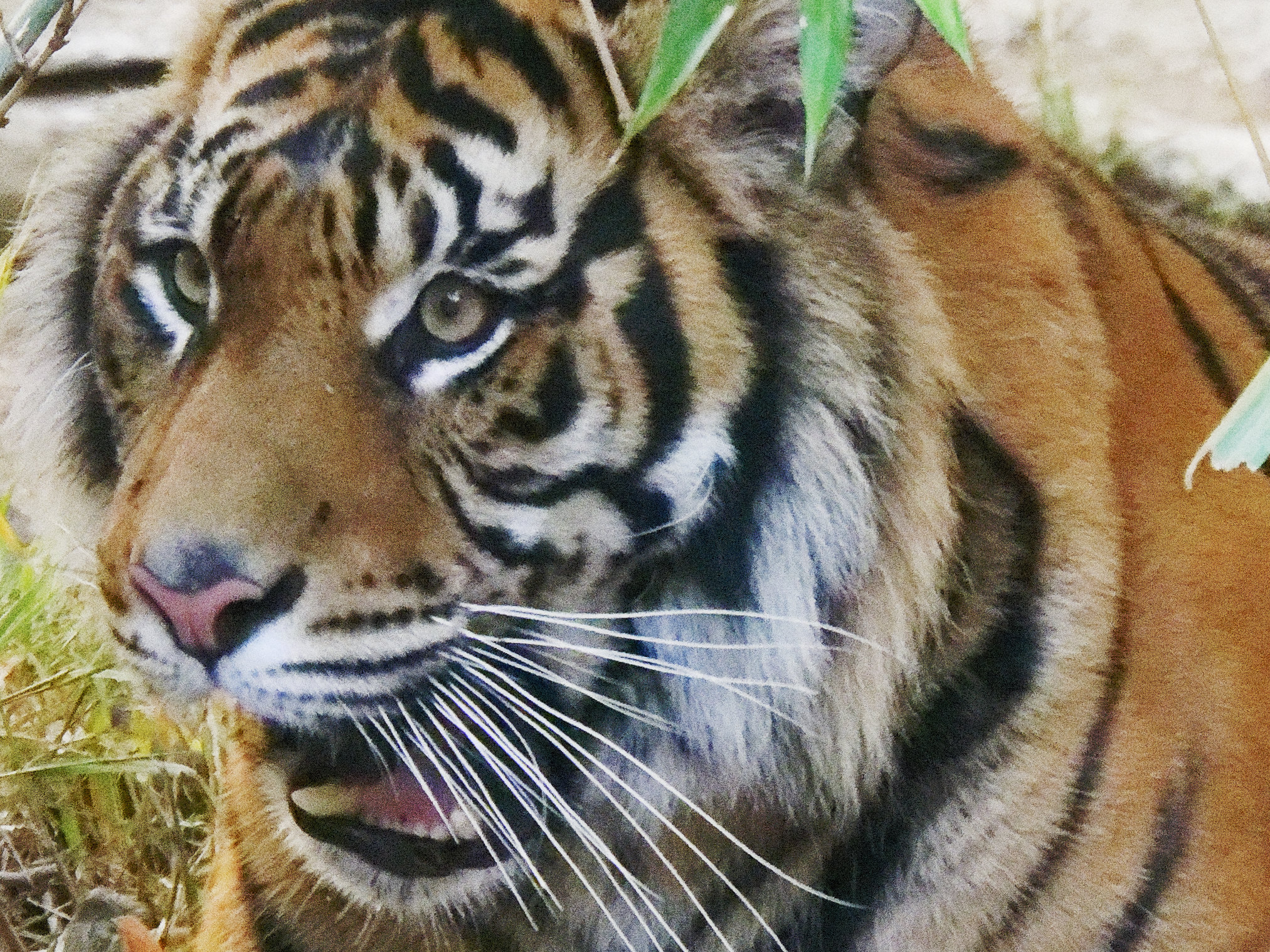
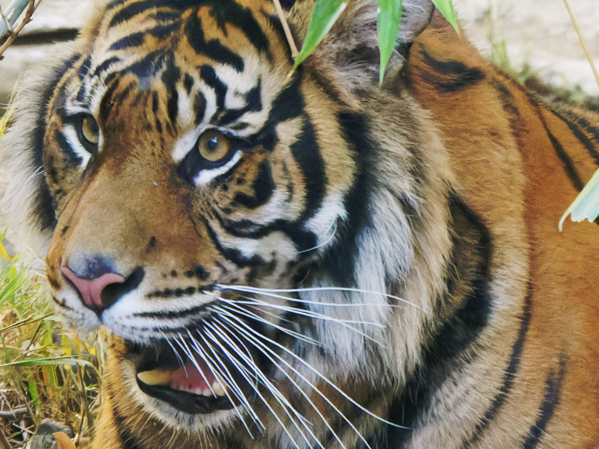
[00:08:23.29] I'll start with this picture here of a tiger shot in the zoo. Now, if I do a compare to the original, we'll see that the original is a bit washed out and a bit under saturated. So, I've already increased the contrast and the saturation on this photo. But before we take a really close look at it, let's check out the metadata. This photo was shot at an ISO of 25,600 and it was shot on a Lumix GX8, which is a Micro Four Thirds sensor.
[00:08:44.21] So, Micro Four Thirds plus really high ISO is not the greatest combination in the world. And if we zoom in close and look at this photo one-to-one we'll see exactly what this photo looks like. If I compare it to the original, you'll see just how much noise is in this photo.
[00:08:57.14] Now, this is a little bit unfair because you would never actually see the file with this much noise. All RAW decoding applies some level of noise reduction, this has turned all noise reduction off, but this is the file that came out of the camera. Standard noise reduction in PhotoLab gives us this… but now let's see if we can do better.
[00:09:13.27] I'll switch over to the detail collection and the first filter is our DxO Denoising and you'll see that it's currently set to HQ or High Quality; that's the fast version. Then we have PRIME and DeepPRIME. I'm going to go ahead and change my preview window to right over the cat's eye and for those of you who are already familiar with PRIME know that you don't actually get to see the preview of the full PRIME Denoising on the main image. You can only see it in the small preview window because this is so processor intensive, it only updates in the preview.
[00:09:40.09] So for this image, when I click on PRIME, we'll see in this preview window here what the prime denoise looks like and it's already remarkably better. It's a lot smoother, there's a lot less noise in there but it's not perfect. Notice the edge of the tiger's eye in here and how it's a little bit bumpy and notice how the fur doesn't have a whole lot of detail in it.
[00:09:58.13] If we go back to the standard denoising, again you don't see that detail and you do see the roughness here, so it's really no surprise that we're seeing that here as well. But when we switch to DeepPRIME, here we're going to see a remarkable improvement; the eye gets sharp and look at how much detail is now restored in the fur of the nose. This is detail that almost didn't appear to be there but it actually was, it was just hidden and the DeepPRIME technology has pulled it out.
[00:10:22.25] If I do a preview from the before and after, you can see just how incredibly remarkable this is. Now, this is just a preview of this one spot, let's take a look at the whole image by exporting this and I'll go ahead and output this into the same folder as the original which is going to happen remarkably quickly and I have to say that that's almost cheating, that's because I'm doing this on a 16-core Mac Pro, so don't expect to get that performance on an average machine but if you've got a Mac Pro, it's pretty fast.
[00:10:51.14] Now that it's exported, you'll see over here that I have the side-by-side versions. I can actually set the view of the reference image to the new version which means that when I click the Compare button, it'll jump back and forth between the rendered version and the previewed high quality version.
[00:11:06.15] So, there's the difference. Now look at that! Look at not just the detail around the eye, but look at the detail around the fur in here and on the whiskers as I compare back and forth between the DeepPRIME and the original high quality version. It is absolutely remarkable.
[00:11:31.08] Now, I've got a couple other photos I want to show you quickly… This one here is not that terribly exciting of a photo; just some colored umbrellas against a painted door but if we look closely, there's a few details that I want to point out. Let me move the preview area up over the handle of this umbrella and once again, I'll bring your attention to the preview window here, you'll notice a couple of things; first of all the edge of the handle there is quite rough and the background, the painted wall here or the painted door doesn't look like it has any texture at all.
[00:11:58.01] As I switch over to PRIME, you'll see that we still have that rough edge and while this has smoothed out, it's almost over-smooth. You have what we call a “water coloring” effect where things just kind of blend together. But now as I go to DeepPRIME, you'll see just how much texture has been restored in this image here and the sharp edge of the umbrella handle is restored as well.
[00:12:18.13] And again, if I click and hold on here to toggle back to the original, you'll see that it appeared that there was absolutely no detail in there whatsoever, but DeepPRIME has pulled some out of it.
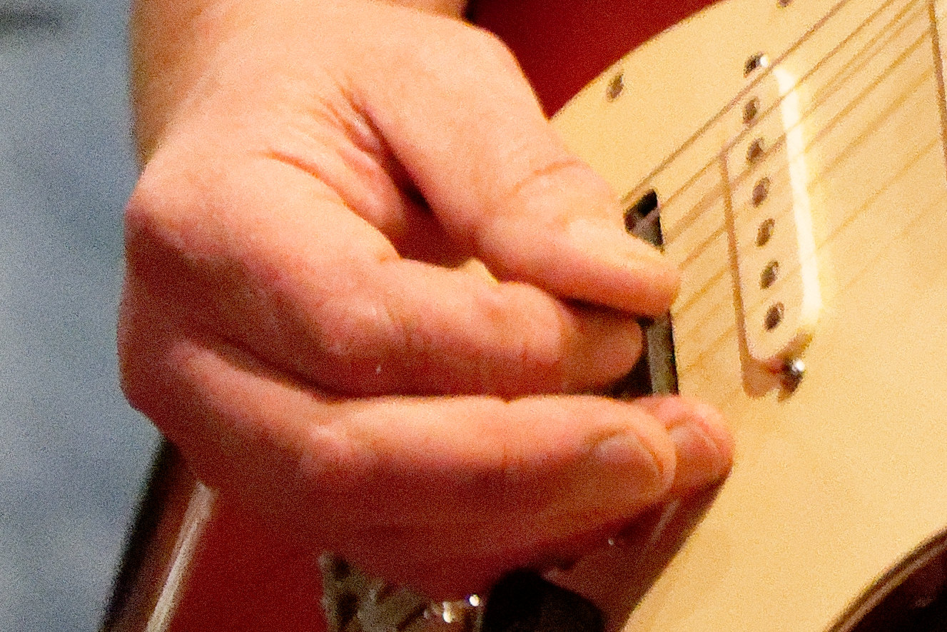
[00:12:33.21] The next photo I want to look at is of this guitarist, shot in low light of course, and this one was shot at 51,200 ISO but it was also shot on a Lumix S1, a full frame sensor and a much more modern sensor. So, already this image looks pretty good for 51,200.
[00:12:47.23] You'll see that there is quite a bit of noise but it's not unusable. However, there are a few details that are lacking. For example, look along his skin here and notice how there's what appears to be yellow splotches on it, almost like he's got bad skin or something. Then if you look at his fingers here, you'll see that there's very little detail in the finger itself.
[00:13:06.02] Well, let's see what we can do with DeepPRIME… I'm going to go ahead and put the preview over his hands here and as I switch from HQ to PRIME, you'll see it gets quite a bit better, some of the yellow is gone, there's still a little bit of that, some of the detail is restored but not as much as we'd like. However, when I switch to DeepPRIME suddenly the skin looks remarkably better and there's an incredible amount of more detail in the fingertips here.
[00:13:36.28] The last image I want to show you is a much older photo. It's not very high ISO, only 12,800 but it was shot on a 5D Mark II. So, over a 10 year old sensor. Now 12,800 ISO by today's standards is pretty much nothing but 10-12 years ago, that was pretty high and as we can see in this photo, it really doesn't look that great.
[00:13:55.02] If we zoom in one to one and go to his face, you'll see that it's just a big mush of noise with a whole bunch of noise in the background and his elbow here with a blue light on it has this strange blotching and blocking going on there.
[00:14:06.14] I'll just switch right over to DeepPRIME and take a look at how smooth his face has gotten. Look at the background, almost completely devoid of noise. Let's take a look at the preview over his arm here and you can see there that blue blotching is almost completely gone. It just looks tremendously better.
[00:14:31.09] What this tells you is that you now have the ability to take some of your older very high ISO, very noisy files that you might have otherwise just discarded and try to breathe new life into them using PhotoLab 4.
[00:14:42.22] So that's everything I wanted to show you today. I hope you enjoyed this quick demo and again, if you want to learn more, head over to PhotoJoseph.com/DxO. Thanks.

