You are here

Platform: macOS

Customizing the Aperture Full Screen Interface

PhotoJoseph's picture
May 3, 2012 - 12:00am

Following up on yesterday’s article “Customizing the Aperture Interface”, today we’ll dive into the Full Screen mode. There aren’t nearly as many options here, but that’s somewhat the point… Full Screen is a stripped-down, only-what-you-need view of your photos.

To prove the point of simplicity, here’s what you get when you hide everything. I’ve left metadata on just to show that it’s actually the Aperture UI; otherwise it’d just look like a photo!

Full Screen Aperture, all UI hidden except the Metadata (tap to view larger)

Toolbar, Filmstrip and HUD

On the other extreme, here’s everything turned on. This screenshot is at 1280 × 720 which is smaller than most of you would work, so you’ll likely see smaller interface elements and larger images. The Toolbar, the Filmstrip, and the HUD (heads up display) are all enabled here.

Share

Customizing the Aperture Interface

PhotoJoseph's picture
May 2, 2012 - 12:00am

Aperture’s standard layout works just fine for most people, however there may be times when you’d like to tweak things a little bit for your own workflow. It could be that you want to hide panes to maximize screen real estate, or maybe the image you’re currently working on gets bigger when you move the Browser, or perhaps it just makes more sense to you to see Inspector on the right.

The most common and well-known UI (User Interface) customization would be the Browser / Split View / Viewer toggle. These three views, rotated through by simply tapping the V key, allow you to see just the Browser (thumbnails or list view), both the Browser and the Viewer in Split View, or just the Viewer. I say these are the most well known simply because there are buttons in the toolbar to flip through these, so chances are high you’ve figured this one out.

But there’s much more you can do.

Rotate and swap the Browser

There are four different places the Browser can live. On the bottom, the left, the top, or the right of the Viewer. There are two commands to control this; View > Browser > Swap Position (⌥W)  and View > Browser > Rotate Position (⇧W). Through a combination of these, here are the four possible layouts:

The four positions of the Browser (tap to view larger)

You can resize the Browser by grabbing the bar between the Browser and the Viewer as well. Depending on which Browser view you are in (Filmstrip, Grid or List), the thumbnails will resize or you’ll see more photos at once.

Swap the Inspector

The Inspector, which is the pane normally on the left that houses the Library, Metadata and Adjustments tabs, can be moved from left to right by choosing View > Inspector > Swap Position (⇧I). This won’t free up any space but it may make more sense to you visually.

Share

Making It Pop in Aperture with the Mid Contrast Slider

Thomas Boyd's picture
April 30, 2012 - 12:00am

I’ll bet many users don’t even know this adjustment slider exists, and if they do, they may not appreciate it’s powerful capabilities.

The Mid Contrast slider is buried in the Advanced drop down menu inside the Highlights and Shadows adjustment brick. Moreover, it’s one of five seldom used sliders. I think it’s fair so to say this a “hidden” feature of Aperture. Well folks, you get it here first for the low low price of free!

Okay, you’re not really hearing it here first because Joseph talks about it in his Live Training videos [Session 009] and I’ve written about it elsewhere… but it is free!

The best I can describe what it does is to say it adds contrast back into an image while still maintaining a degree of shadow detail that lost contrast after the Shadows slider was applied. Essentially, it makes an otherwise flat image pop while still retaining shadow detail.

In typical user manual fashion, the only thing it says about Mid Contrast is this: “Sets the amount of contrast in the midtones”. That’s not very descriptive and is one of the reasons it’s not well known. That’s also one of the reasons this site exists!

Using the Mid Contrast slider

First make sure you have an appropriate image. It’s not going be something you want to apply to every photo in your library, but it does help many different kinds of images.

Make sure you can see your Highlights and Shadows adjustment brick, then click the drop-down arrow that says Advanced. That reveals five more adjustment sliders; Radius, Color Correction, High Tonal Width, Mid Contrast and Low Tonal Width. We are going to concern ourselves with the Mid Contrast slider — the others don’t make much of a difference.
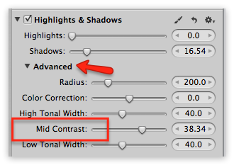
Highlights & Shadows adjustment brick with Advanced adjustment sliders exposedFirst, slide the Shadow slider to the right. Don’t go too far; just enough to open up the shadows a bit. You don’t want them turning “chalky”.

Share

Adding EXIF Data to Scans or PhotoCD Files

PhotoJoseph's picture
April 29, 2012 - 12:00am

Check out this piece of ancient history I found in my office…

Hey grandpa, what is this thing?

An old Kodak Photo CD. Chrome scans from 1995. Wow. When I inserted the CD, iPhoto automatically launched and offered to import. I quit it and launched Aperture, but guess what… Aperture doesn’t import these things. So if you have any laying around, import ‘em quick using iPhoto!

So I imported the lot into iPhoto, and chose Reveal in Finder to locate the originals, which surprisingly opened the iPhoto Library package to show me the files. Interesting. So I copied those out to import into Aperture.

As you probably know by now, my file naming convention contains the yyyy-mm-dd_hh-mm-ss of the image capture, but as it goes without saying, these photos don’t have valid date and time stamps. In fact the stamp they have is from the moment of import off the Photo CD. But that’s OK, I have a nice little workaround for changing the dates on photos and building it into the file name. It’s my double-import trick.

Double-import to correct date & time stamps

Here’s what you can do in a situation where you have images with known incorrect time stamps that you want to correct prior to import, so ultimately the file names can have accurate date info in them.

  1. Import the photos to Aperture as Referenced. Leave them in the original location, and don’t change the names. This import goes extremely quick since Aperture is just making a reference to the file, and not moving or copying it. In fact the fastest way to do this is to simply command-option drag the photos into an empty Project. This imports as referenced and leaves them where they are (same key-combo to drag-create an alias in the Finder).
Share

DPHOTO: 10% Discount and iframe Embed Techniques

PhotoJoseph's picture
April 28, 2012 - 12:00am

More good stuff from the world of DPHOTO

10% discount

The fine folks at DPHOTO are offering a 10% discount for new accounts for ApertureExpert readers! Also if you created a new account since we posted the original article on Sunday (DPHOTO: A Viable Alternative to MobileMe?”), just contact them at support@dphoto.com and be sure to give them your user name, and they will apply that to your account.

Also if you sign up for the free trial using the discount code, you’ll get the Pro account for 30 days instead of the more limited trial account, so you can really get a taste of all the features.

Use the code AE201204 on the signup page to get your discount.

iframe embedding

There currently isn’t a simple “grab code to embed” to post your photos elsewhere, but you can embed the gallery in an iframe. Just drop this code in and you should be good to go. (click the source icon to open a window with plain text):

Share

A Modified Mobile Workflow in Aperture

Thomas Boyd's picture
April 27, 2012 - 12:00am

I just had an unusual set of circumstances that required a complicated Aperture workflow I’ve never used. I had to put some thought into how I was going to do it, so I thought I’d make it easy on everyone else and describe what I came up with.

I recently shot an editorial assignment for ESPN The Magazine (I’ll post a link when it’s published). I had over 99 GB of images from this assignment. The deadline was three days past the shoot so I had some time to get the images edited and sent. I also had another out of town assignment leaving a day after my return. I would not be able to do the work using my normal workflow on my iMac at home.

I needed to be able to take this huge shoot on the road, but at the same time, I didn’t feel comfortable leaving without having this work backed-up. Plus, I needed the CF cards for the next shoot.

My normal mobile workflow is much less complicated. I import to a referenced library on my MBP, do my work and send the images. When I return to my office, I then copy the images to a hard drive, import the library to my archive library as a project and Locate Master Files. 

Here’s how I solved the problem

After a long day of shooting and driving, I created a new Aperture library on a portable FW800 hard drive and imported the images with my iMac running this library.

Share

500-wide, an Aperture Plug-In for 500px.com

PhotoJoseph's picture
April 25, 2012 - 12:00am

500px.com is fast becoming an extremely popular website for sharing your best work. I think one of the big differentiators between 500px and anything else out there is that you’re encouraged to only share your best images here. Lately though I have stumbled upon a few collections where users treated it more like Flickr, uploading 20 similar photos, and that may be the fault of 500px’s new pricing strategy. Even though I’m not a big user of 500px myself (I only recently started uploading photos to it), I hope it can stay true to its roots and focus on great photography, not mass consumption of every “it’s in focus so it must be good enough” photo out there.

An Aperture Plugin for 500px

500-wide is a new Aperture plugin from Blue Crowbar Software that honors the original idea of 500px — it’s only for your best. I say this because the plugin only allows you to upload a single image at a time. While I was originally resistant to this idea, I have come to appreciate it’s simplicity. When the plugin restricts you to selecting a single shot to share, it’s telling you to really focus and pick only your best. It does mean that when you’re first uploading your portfolio-quality images you’re probably going to skip the plugin and use the 500px web interface, but that’s fine. When you get into the routine of sharing just your best shots here and there, the plugin works perfectly fine.

Once installed, the plugin is found with the rest of your export options under the File > Export menu. The interface is pure and simple.

The upload interface for Blue Crowbar’s 500-wide Aperture plugin for 500px.com

The title is taken from the Title IPTC tag, which I don’t believe is very widely used. Most users may be expecting the title to be pulled from the Aperture Version Name tag, as it is for most image sharing services, however once again I appreciate this step. I don’t like changing my Version Names to anything other than the original Master Name, with perhaps a unique identifier at the end. This allows me to have a Title and my separate Version Name and never the two shall meet. The Description field is pulled from the IPTC Caption, as expected.

Share

DPHOTO: A Viable Alternative to MobileMe?

PhotoJoseph's picture
April 23, 2012 - 12:00am

With MobileMe Galleries in their death throws, many users are looking for an alternative. The topic comes up here every so often, and of course there are loads of different places to show off your photos, such as Flickr or Facebook or Smugmug, but none that seemed to offer the simplicity and elegance of MobileMe.

Share

Pages

You may login with either your assigned username or your e-mail address.
Passwords are case-sensitive - Forgot your password?
randomness