Creating Split Tones in Aperture 3
Check out the video version of this tip at the end!
Split toned images are those photos where the original color is gone, and the shadows shift to one tint while the highlights shift to another. If a monochromatic image has only one tint added to it, such as a brownish tint making a sepia image, that’s simply a color tint. But when you split the shadows to one direction and the highlights to another, you have a split tone.
I released a preset pack called “ApertureExpert’s Preset Pack Split Tone” quite a while ago, and while of course you can reverse engineer those to see how it’s done, I thought I’d share the process here. It’s quite simple, and this way you can make hundreds of your own presets, too.
The starting point
Like any effect, there are images where this treatment works very well, and images where it simply doesn’t. Here’s the photo I’ll be starting with. It’s largely monochromatic to begin with, but that’s actually not terribly important. What’s more important is that it has good range from shadows to highlights. In this shot the sky is blown out (it was a terribly overcast day) but the statues themselves have good range from dark to light, and that’s the part of the image we’ll be focusing on.
 The original image shows good tonal range in the statues, making a great candidate for the split tone effectUndoubtedly you’ll want to experiment, and you’ll find that some photos look awful with this treatment, while others look great.
First, go monochromatic
The first step is to remove all the color from the image, but you can’t actually use the Black & White adjustment in Aperture for this. The Black & White adjustment happens after the Curves adjustment in Aperture, and the Curves tool is where we’ll make the color magic happen — so if you use Black & White, you’ll effectively be removing all the color that you added/changed in Curves. Therefore you need to remove the color before Curves, and that means simply reducing the image Saturation to zero in the Enhance tab.
 Remove all original color by desaturating the image, not using the Monochrom adjustment
Just remember that before you can add your own color, you have to take away what was already there.
Add Curves
The color addition comes from what may be a surprising tool — Curves. So the next step is to add Curves to your adjustment set (if it’s not already there). Curves aren’t on by default, but many users will have already added it to their default set. If you don’t see it, just click on the Add Adjustment menu, and choose Curves.
 Curves is where the color magic happens
Pick a color channel
Once in Curves, if you’ve been here before, you know how this works. If you want to make the shadows darker, you grab the lower part of the curve (covering the left half of the histogram) and drag the line down. If you want to make the highlights brighter, you grab the right side of the curve, and drag up. However if you do that now, you’ll be affecting all three channels — R, G and B (Red, Green and Blue) — at the same time. This won’t add any color since each channel is being changed simultaneously.
Therefore the trick here is to work on just one channel at a time. To do this, click on the Channel menu in the Curves dialog, and pick a channel. In this case, I’ll choose Blue.
 Choose a color channel to work with from the Curves Channel menu
NOTE: If you see Luminance at the top of the Channels list, and not RGB as shown here, you can change that under the gear menu in the top right corner of the Curves adjustment, at the bottom of the list, under “Grayscale”. Which this is set to doesn’t seem to affect the split tone process, but it will make a difference when using Curves to make exposure changes (and in this case you will probably want it set to RGB). Check out Live Training Session 011: Adjustments; Curves to learn more about using Curves in general.
Now when you make changes, color will be added to your monochrome image! There are really only two things to remember to gain control over this, and from there on it’s all about experimenting to see what works with any given image.
- The left side (lower half) of the curve controls the left side of the histogram, and therefore the shadows to low mid-tones. The right side (upper half) controls mid-tones to highlights. You’ll be adding a different color to each side to create a split tone.
- Every color has an opposite (complement), so dragging the curve up will add the channel color, and dragging it down will add the opposite (technically subtract the channel color, leaving the opposite behind). The opposite of red is cyan, the opposite of green is magenta, and the opposite of blue is yellow.
A complementary color chart, from wikipedia creative commons
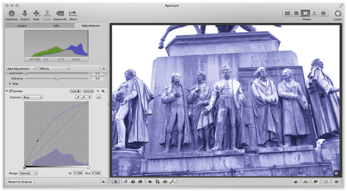
Using the sample image, if I drag the left (shadow) line up (to add), that will add blue to the shadows.
 Raising the blue will add blue to the shadows
Of course you may have noticed that the entire image went blue, not just the shadows. That’s because if you look at the curve, with the single point drawn on it now, we’ve increased the blue in the highlights as well. So to counter that, you need to pin the curve down and keep it relatively straight along the default line for the highlights, like this.
 Pin down the curve to keep the highlight areas on a straight line to keep the color out of that range
Now you’re ready to add another color into the highlights. You can actually do it all with this one blue channel, if you wanted to use yellow as your highlight color. To do that just move the highlights down to add yellow (actually remove blue) from that tonal range. There’s no one right place to put the curve; it really depends on the image you’re working on. But a simple S-curve like this usually works quite well!
 A simple S-curve on a single color channel is the quickest way to create a split tone
Pick another color channel
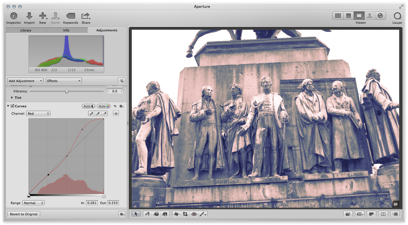
The other option is to leave one range pinned down (as above; the blue is pinned flat on the highlights) then to select another color channel, pin down the shadows, and alter the highlights. Here I’ve reverted the blue channel to as it was two screenshots ago (shadows raised to blue, highlights pinned to flat) and then switched to the red channel, pinned down the shadows, and raised up the highlights.
 By pinning down highlights in one channel and shadows in another, you can mix channel colors in single split tone
In the Curves dialog, if you switch the view back to RGB, and enable Show RGB Overlays, you can see all of the curves simultaneously. Notice below that you can see both the blue shadows and red highlights as adjusted.
 Enabling “Show RGB Overlays” lets you see all channels at once
Affecting exposure and contrast using Curves
You may find that you want to adjust the exposure and contrast in the image, and you may want to use Curves for that as you normally do. There are two ways you can do this.
With the Channel selector set to RGB (you may want it set to Luminance, which you can change under the gear menu, but generally RGB works best for this as it’ll retain and possibly even enhance the colors you’ve added), grab the curves line and make the changes you normally would. Once again a simple S-curve will add contrast, darken the shadows and brightening the highlights. The curve can get a little messy-looking at this point (you can always hide the RGB channels by deselecting Show RGB Overlays if it’s too hard to see your lines), but that’s what you’ve created!
 You can still adjust the RGB curve to enhance contrast and alter exposure
If you want to keep the split tone adjustment separate from the exposure and contrast changes, then you may want to add a second Curve adjustment to control that on its own. The result will be the same, but it may make making those changes easier. All the presets I built are set up that way, just to make it easier to follow. To do that, click on the gear menu in the Curves adjustment, and choose Add new Curves adjustment.
Other alterations
What other changes can you make to the image? Of course there’s an infinite number of options, and if you don’t care about sticking with the split tone, you might get some cool results by adjusting colors elsewhere. Look at what happened to this image when I pushed the saturation (which was original set to zero to render it monochromatic, remember) all the way up to 2.0 — neat!
 OK it’s no longer a split tone, but pumping the saturation UP sure looks cool!
Save your preset effects
Don’t forget that if you come up with something great for one image, it might work on another as well — or at least be a great starting point. Be sure to save your adjustment set as an Effect preset, by clicking on the Effects menu, and choosing Save as Effect…
 If you come up with something good, save it as an Effect to call on later
What other tips do you have for making great split tones?
Video version
More like this
- Store
- Tip
- Tip
- Forum
- Forum

Comments
on July 3, 2013 - 5:20am
missed your tutorials, even this one being a small one it’s very appreciated.
Greetings from Madrid!