Alternate Main Viewer Views in Aperture 3

The Aperture Viewer is the part of the Aperture interface where you view your photos large. I think most users leave this in the standard “Multi” view the vast majority of the time, and many may not even be aware that there are multiple modes for the Viewer. This post is all about those various views, and how to use them.
 The View > Main Viewer menu has multiple options to choose from that you may never have seen
Show Multiple
Show Multiple is the standard, default view for the Main Viewer. What this means is that you can view one or more images at a time. You can select multiple images contiguously by shift-clicking on a range, or non-contiguously by command-clicking on any images you want. This is the most flexible view, allowing you to quickly place whichever photos you like side by side.
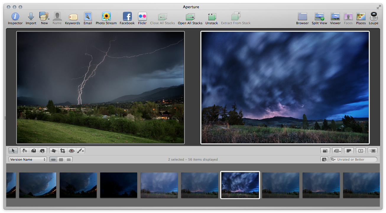 “Show Multiple” view lets you see whatever images you like side by side (tap to view larger)
Show One
As the name Show One implies, this allows you to see only one image at a time. Honestly I’m not quite sure of the point, since Show Multiple can also show just one, but there you go. If you don’t even want the ability to choose more than one photo at a time, choose this one. Or don’t. Seems silly.
Three Up
I’m a big fan of the Three Up view when doing an initial photo edit, as you’re looking at each photo for the first time. Since you’ll often have multiple similar photos in sequence, this allows you to see them quickly side by side, without having to do any multiple selections. It can be a very effective way to run through a sequence of shots and identify which you like best. Since you’re viewing three photos at once, the images will get smaller on screen of course, so this is best on larger displays. I probably never use this on the 11” MacBook Air, but I use it often on the 27” iMac.
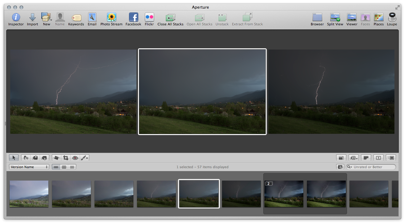 “Three Up” view is a great way to do your first-look photo edit (tap to view larger)
Compare
The Compare view is very useful when you’re looking at a pile of images and trying hard to decide which is best. The current “compare” photo is bordered in green, and as you arrow through other photos in the sequence, the compare photo stays put. As you see an image that you like better, you simply tap the Return key to set that image as the new compare. It will slide into place, and be bordered in green.
Here is a sequence of events, comparing a collection of photos. In the first screenshot, the Compare mode has been set, and we have image #1 on the left, bordered in green, and are comparing it to image #2, on the right.
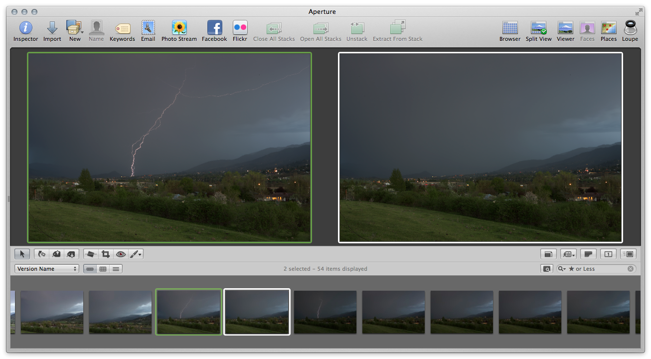 “Compare” view, step one — comparing photo #1 to photo #2 (tap to view larger)
In the above example, image #1 is superior, so it’s left alone, and we tap the right arrow key to compare to image #3.
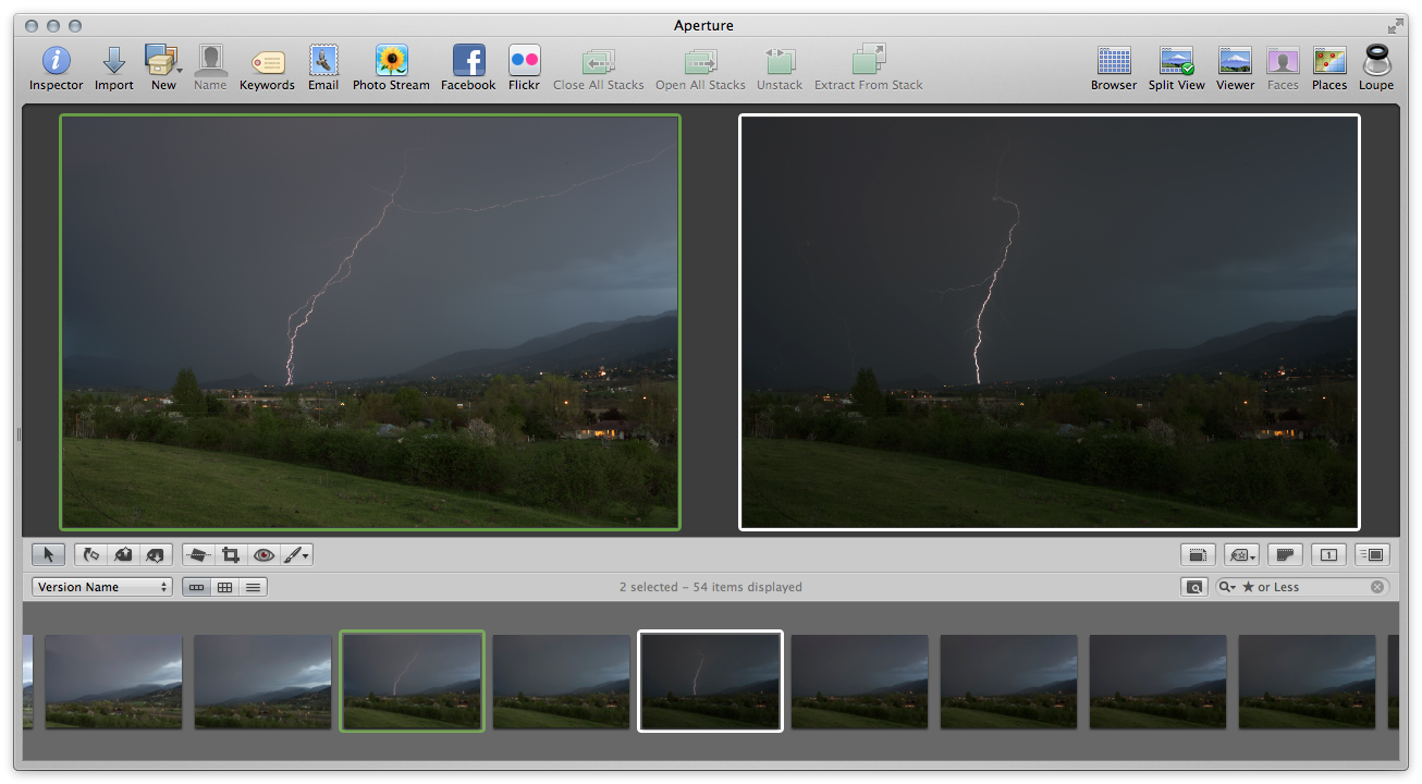 “Compare” view, step two — comparing photo #1 to photo #3 (tap to view larger)
In the above example, I now want to compare the image on the right to others in the sequence. By hitting return, that image slides into the Compare position, the first image is dropped, and I can now compare the new one to the next image in the collection.
 “Compare” view, step three — photo #3 was moved to the compare slot as the new favorite, and the comparisons continue
The key to this view is remembering that all you have to do is tap the Return key to set a new “compare” image, then use the arrows to place it next to other photos.
Stack
The Stack view only works if you’re looking at image stacks. Remember, a stack is a collection of similar photos that you’ve stacked (select images and choose menu Stacks > Stack), and the purpose of a stack is to pick a single best shot, and have the rest hidden behind it. This Stack view allows you to quickly navigate all images in a stack, promoting and demoting photos as you see fit to set a priority, and ultimately, choose the Stack Pick.
Like in the Compare view, you have a locked image on the left bordered in green, which you’re comparing other photos to. The difference here is that when you select a new image to compare to, that photo goes to the top of the stack, becoming the new stack pick. If you then select another image as the stack pick, the previous pick slides into second place.
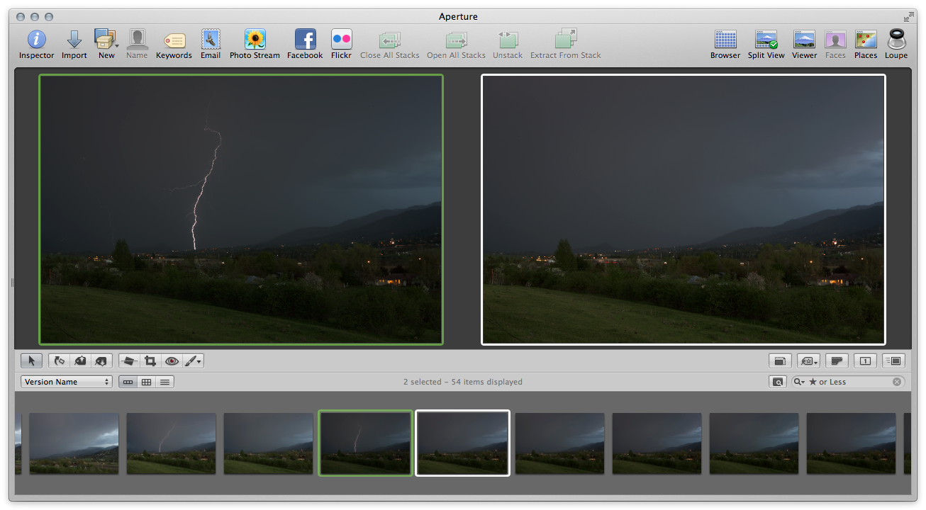
 “Stack” view, step one — the “current pick” is on the left in green, and another photo from the stack is on the rightIn the above view, the Current Pick is on the left, bordered in green, and on the right we’re seeing #4 of 18, so the fourth image in a stack of 18 similar photos.
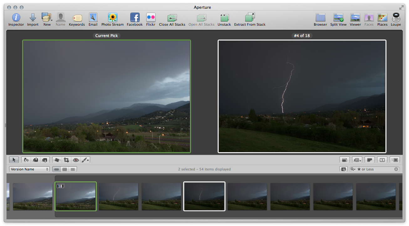
By selecting Stacks > Pick, that image #4 slides into the Current Pick position. It’s good to know the keyboard shortcuts for these to move quickly. (I believe the default for Stack Pick is ⌘\ however on my system I’ve changed it to ⌘/ because the default conflicts with 1Password).
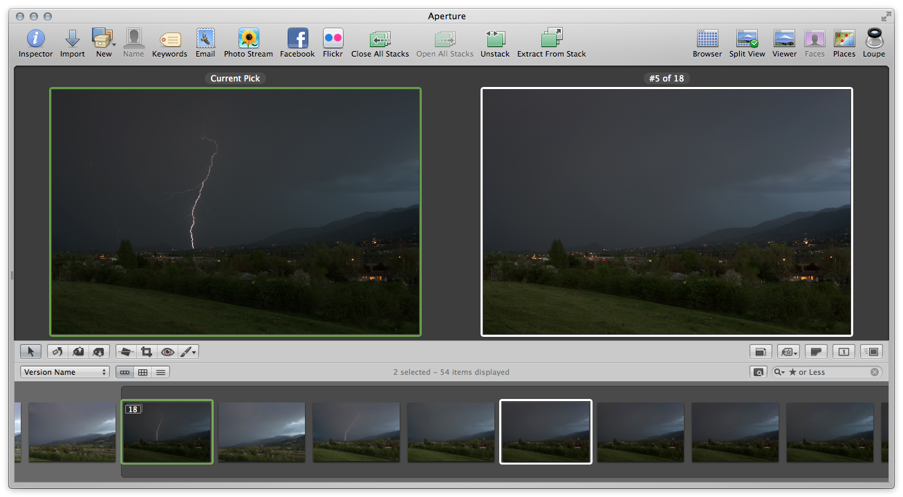 “Stack” view, step two — image #4 was moved to the Stack Pick, and is now comparing to #5 (tap to view larger)
If you compare the above two screenshots, you’ll notice that the image that was #4 has moved into the Pick position, and is now being compared to the next image in the stack. Notice that the thumbnails have moved as well; the dark photo with the lightning strike has moved to the top of the stack.
For those that use stacks, this is a very effective view. You can also promote and demote images in a stack by dragging them or with keyboard shortcuts, making it easy to set an order of preference. This is also a very effective client-review view. If the client is looking over your shoulder pointing out favorites, as they make selections you can promote and demote images to their taste, helping them to ultimately narrow it down to their favorite photo.
Which view is best?
OK that’s a loaded question; clearly there’s no “best” as it depends on what you’re doing. As stated before, most users will get by just fine with the default Multi view, but it’s worth knowing the other views as they can definitely save time in doing your photo edits.
How do you use these different views?
Reader John Mather below pointed out something I’d never noticed — the keyboard shortcuts for this menu spell out “U R HOT”. Pretty funny :)
However that reminded me of something I’d left out of this post — the explanation of the keyboard shortcuts, and how to remember them.
Here’s the list again:
 The shortcuts spell U R HOT… funny
Notice the position of the shortcut letter in the words…
- The shortcut for Multiple is ⌥U — mUltiple
- Three Up is is ⌥H — tHree
- Compare is ⌥O — cOmpare
- Stack is ⌥T — sTack
With the exception of Show One, which is IMHO useless anyway, it’s always the second letter of the word that is the shortcut. Cool! Perhaps that became ⌥R just to round out the “U R HOT” display.
Comments
on May 4, 2012 - 2:33pm
Notice the sequence of shortcuts, top to bottom. U R H O T
on May 5, 2012 - 1:07am
John,
LOL I had never noticed that. However that does remind me of something I left out of the post… updating now.
@PhotoJoseph
— Have you signed up for the mailing list?