Using Control Points in Nik Color Efex Pro 4
In my last article, I gave a brief overview of Color Efex Pro 4 (CEP). Before I continue this series by highlighting some of my favorite filters and how to use them, I need to cover one intermediate point: Control Points.
In this article, I will be using examples within the CEP interface, but control points are used throughout the NIK suite. Therefore, the concepts that I discuss can be applied to any of the other NIK plug-ins that use control points.
What Are Control Points? Why Use them?
Color Efex Pro 4 has 55 filters that can be applied individually to images or stacked to create more dramatic effects. Control Points are a way to apply any CEP filter to just a portion of an image. This is helpful if you want to (for example) apply contrast to a specific area or color range of your photo. One aspect of control points that make them particularly helpful is that they're essentially smart masks; they are aware of their surroundings and recognize changes in color. More about that in a moment.
Understanding Control Points via An Example
The easiest way to explain how control points work is through an example, so let me show you how to use them when editing an image. For this demonstration, I have purposely picked a nondescript image (below) for two reasons. First, it will allow me to show how control points are useful for directing the viewer through your composition. Second, the scene that I've chosen represents a common compositional scenario (blue sky background, structure, green grass foreground), so applying the lessons from this example should be straightforward.
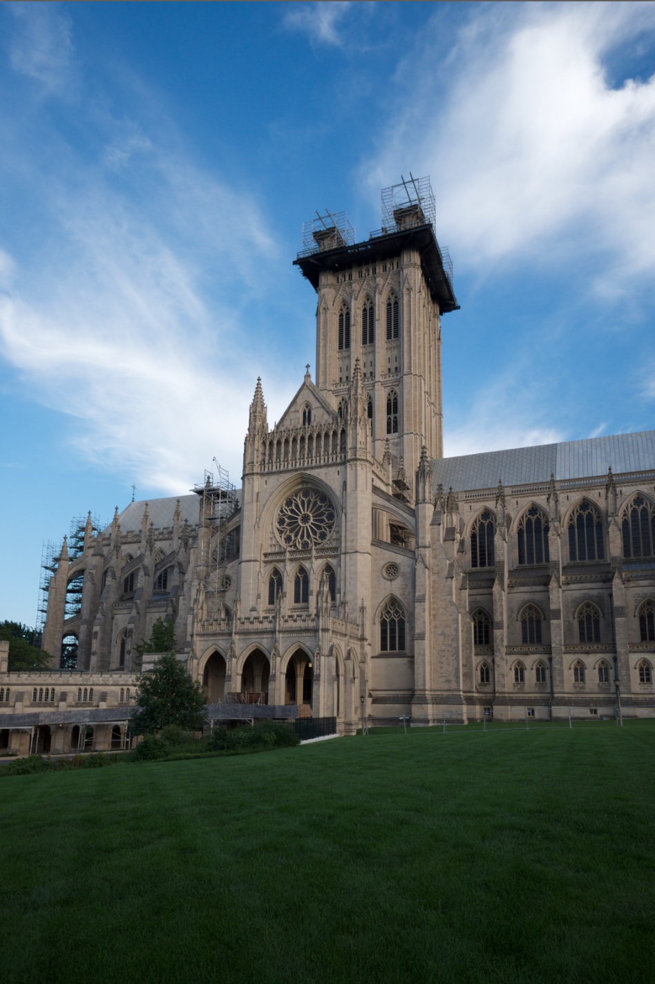 This is the image that I will use for this example.
Before opening this image in CEP, I first corrected the exposure and white balance in Aperture. Then I opened CEP via Photoshop, as I explained in my last article. (If you open CEP from Aperture, all of the steps below remain the same.)
Looking at the image in its current state, I have two goals that I am looking to accomplish with this edit. First, as a matter of composition, I want to draw the viewer's eye away from the edges of the image and toward the structure. I also want make the colors pop and warm up the structure without losing any of the sky's blueness.
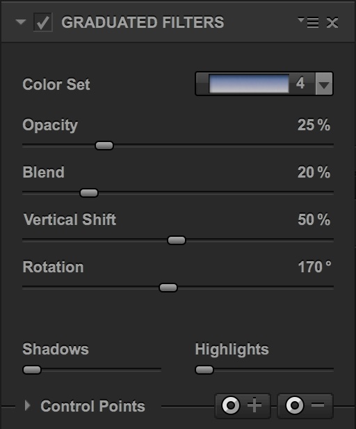 Graduated Filters: This is the control dialog for the first filter that I will apply.
After opening the image in CEP, my first step is to apply Graduated Filters to darken and intensify the color within the sky. Using the parameters shown in the figure above, I successfully accomplish this goal. But there's a problem: Because this filter works as a standard photography grad would, it has darkened the top of the tower, as well, and I would prefer not to have that happen.
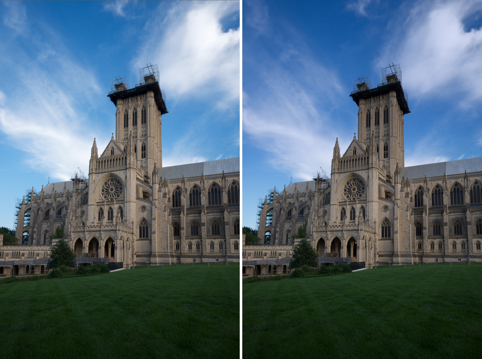 Left: The unaltered image. Right: Applying Graduated Filters makes the sky a richer blue, but the top part of the tower also is affected by this change.
This problem is easily resolved via a control point. To do this, I will click on the small triangle to the left of the words “Control Point” to reveal some additional functionality (example below).
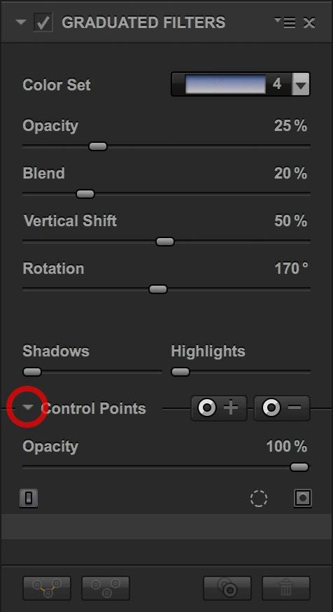 Clicking on this triangle reveals some added functionality. Every filter in CEP has this.
The first thing you'll notice is a new slider labeled Opacity. While I'm not going to use this functionality specifically in this article, this slider represents one of the most powerful features in CEP. Every filter in CEP has an Opacity slider, and adjusting this slider allows you to dial back the effect of any filter in your stack. (Photoshop users: this slider is the equivalent of adjusting the opacity of any Photoshop layer in the Layers palette.) Setting the Opacity at 100% applies the filter at full effect, and sliding towards 0% will slowly reduce the opacity – and therefore the effect – of the particular filter.
The Opacity slider is powerful because roughly a quarter of the 55 filters in CEP are really only useful when they are applied in small amounts, and the Opacity slider is what allows this to happen. As an example, Contrast Color Range and Photo Stylizer are two filters that are most useful when applied at ~ 10% opacity.
Going back to our example, my next step is to subtract the Graduated Filter effect from just the tower. To do this, I will click on the button with the minus sign on it (see example below). When I do this, the cursor turns into a mini crosshairs. I will use these crosshairs to click anywhere within the tower.
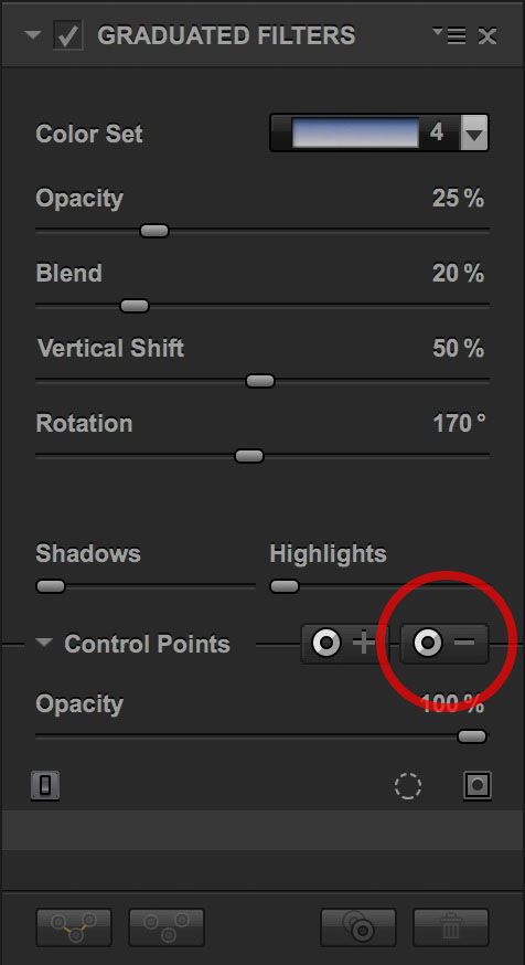 Control points allow you to add (or subtract) a filter to a portion of the entire image. Here, we’re going to subtract Graduated Filters from a portion of the filter, so we’ll select the ‘minus’ icon.
After I click, a few things happen. First, the control point is placed on the image. In practice, this means that the tower gets brighter because the Graduated Filter is no longer being applied to this portion of the image. Also, note that the control point itself has two sliders attached to it: One controls the size of the control point and the other the opacity. Finally, looking to the right side of the CEP screen, a list (in orange) is started with Control Point 1 as the first item. I'll provide more context about all of these features in a moment.
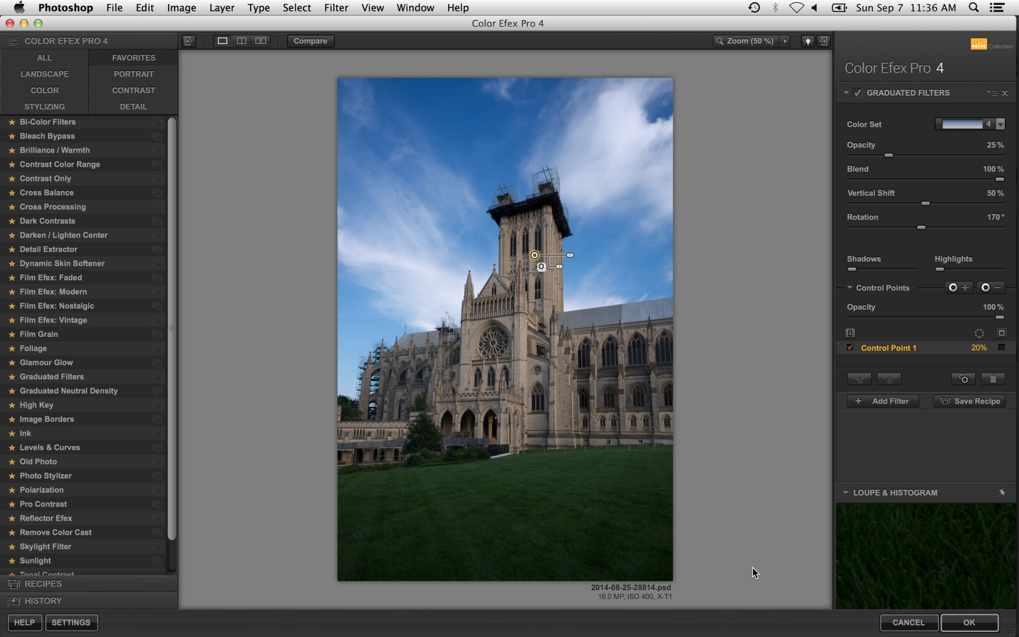 This is what the workspace looks like after a control point is added. The point appears in the workspace and in a list (orange) in the right pane.
For now, I just want to see what this control point is doing. To do this, I can click on the mask icon to fill the check below immediately below the mask icon (see below). When I do this, my workspace changes to a black and white image that represents a mask. Everything that is white is where the Graduated Filter is being applied, and the black areas are where it is not being applied.
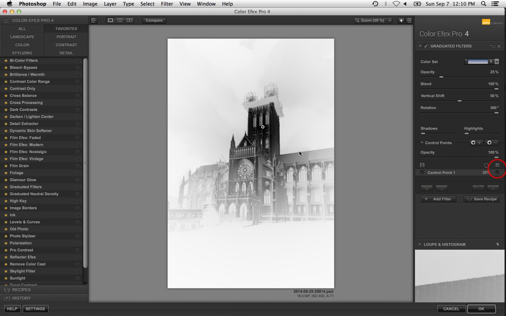 Clicking on the circled mask icon toggles mask mode. When in this mode, black regions are where the filter effect is _not_ being applied.
As I mentioned above, the great thing about control points is that NIK uses smart masking to apply their effects. For example, in this case, you'll notice that none of the subtraction was applied to the sky surrounding the tower. This is because the control point is smart enough to know that the sky is a different color from the building and is guessing that I don't want to include the sky in my control point's action.
In this case, I have successfully subtracted the tower from being subject to the Graduated Filter, but there's also some scaffolding around the top of the tower that I would like to have avoid the filter effect, as well. To do this, I need to add another control point on the scaffolding. There are two ways to accomplish this. First, I could click on the 'minus' icon (just as I did earlier) and repeat the process. But it would be easier if I could just duplicate the existing control point and drag it to the scaffolding. To do this, I will hold down the Option button on a Mac (Alt on a PC), click and hold on the existing control point, and drag a new control point to the scaffolding.
When I'm done, I should have two control points and (still in mask view) the workspace will look like this:
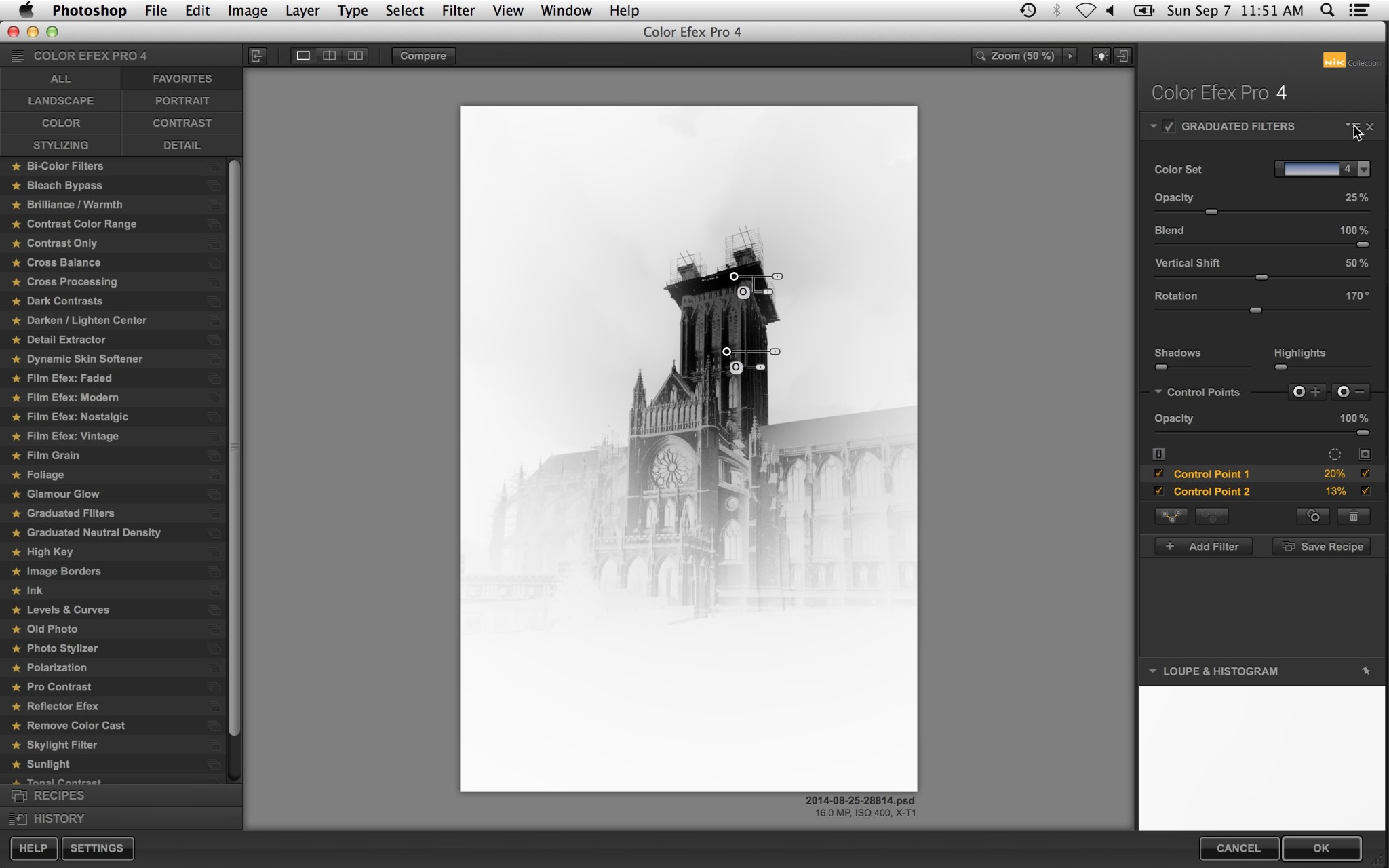 This is what the workspace looks like after placing two subtractive control points to remove the graduated filter effect from the tower.
For the purpose of this image, I am done with this Graduated Filter and ready to move on to adding the next filter in the stack. However, before I move on, let me explain some of the other nuances of using control points.
As I mentioned above, every control point has two sliders that are physically attached to it. The top one controls the size of the control point, or, more accurately: the extent to which the control point will exercise its influence. The lower slider controls opacity, which gives you even further control over how much the control point will (or will not) affect the image. (As a quick exercise, toggle mask mode and play with these two sliders on any control point. You will quickly come to understand how they work.)
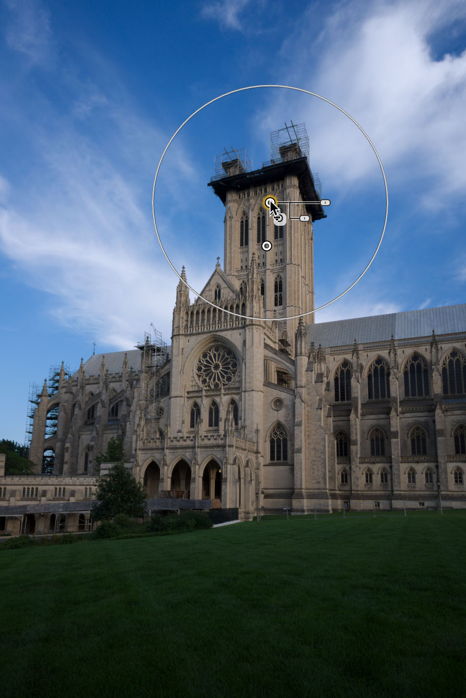 Control points have two handles: One is used to change extent and the other affects opacity.
There are also some useful features that can manage the group behavior of multiple control points. First, you can select multiple control points at once (assuming you have applied more than one to your image) for the purpose of copying and pasting them between different filters. The copy/paste feature is hidden under a drop down; see the top red circle in the image below. You can also group them together via the group button for the purpose of controlling all control points' size and opacity at once (see the bottom red circle in the image below).
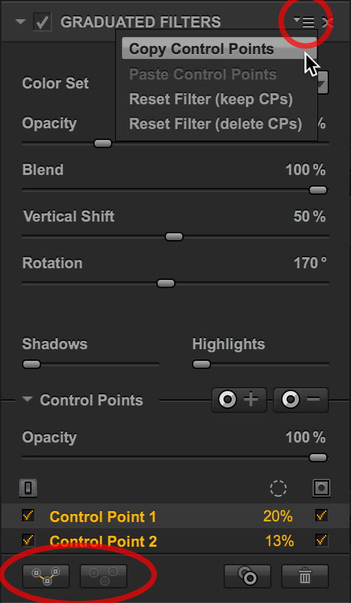 There’s a semi-hidden (or, at the very least: non-intuitive) drop down up top that gives access to copy/paste functionality. Below, these two buttons allow for grouping/ungrouping of control points. This is useful if you want to (say) change the size or opacity of all of the control points at once.
Okay, back to the image. For the next filter, I will use a Graduated Neutral Density to brighten the foreground slightly more than the sky. Again, I am looking to draw the view's eye toward the structure from the foreground, and this filter will help with that, especially after I apply the filter after this one. I won't apply any control points to the Graduated Neutral Density, and that's a good lesson in itself: You don't need them on every filter.
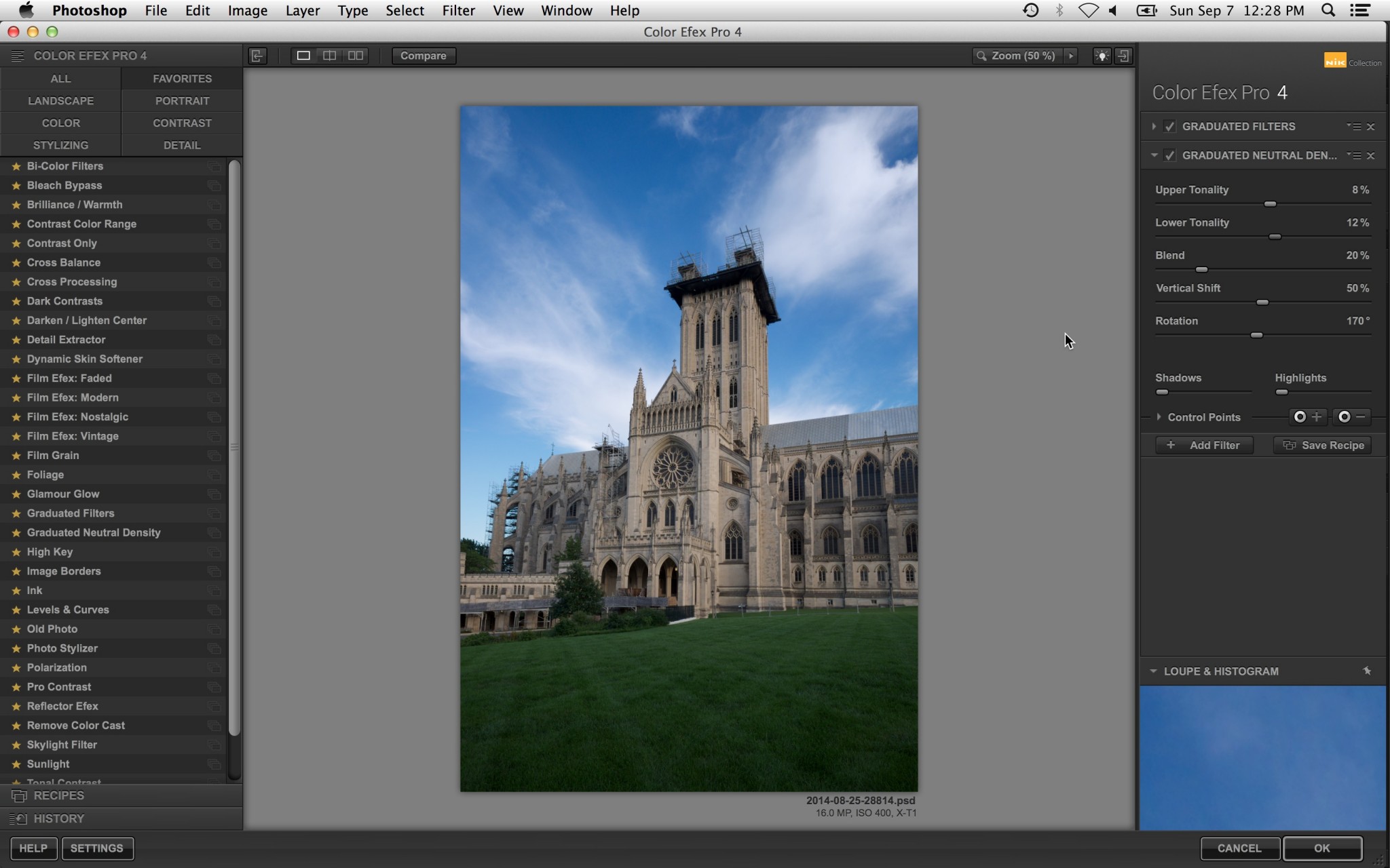 The workspace after Graduated Neutral Density is applied.
As I mentioned in the beginning of this process, two of my goals are to increase color saturation and direct the viewer's eye toward the cathedral. To do this, I will rely on one of my favorite tricks: Using a control point to achieve an effect that was likely not what the NIK software engineers had in mind when they designed a specific filter. (I've got a whole bag full of these tricks, and I will share a few of them in future articles.)
For the third filter, I will choose Bi-Color Filters with Moss Color Set #1. Personally, I haven't found a situation where applying this particular filter across an entire image has ever been useful, but this filter happens to have the property of making grass look great. The trick is to selectively apply it using a control point.
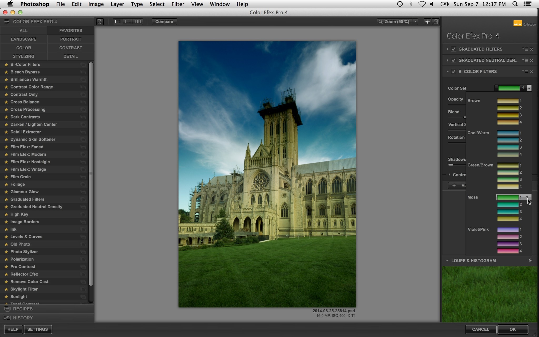 The Moss #1 Color Set in Bi-Color Filters is useful for making grass look great. We’ll use a control point to apply this filter just to the grass, sparing the rest of the image the green toning.
This time I will click on the 'plus' icon because I want to add this filter to a specific part of the image. After clicking on the + icon, I will place a control point on the grass. While I'm at it, I will also add a subtractive control point to the cathedral to remove any remaining green tint applied by the filter. Looking at the workspace in mask view confirms that the filter is applied only to the foreground:
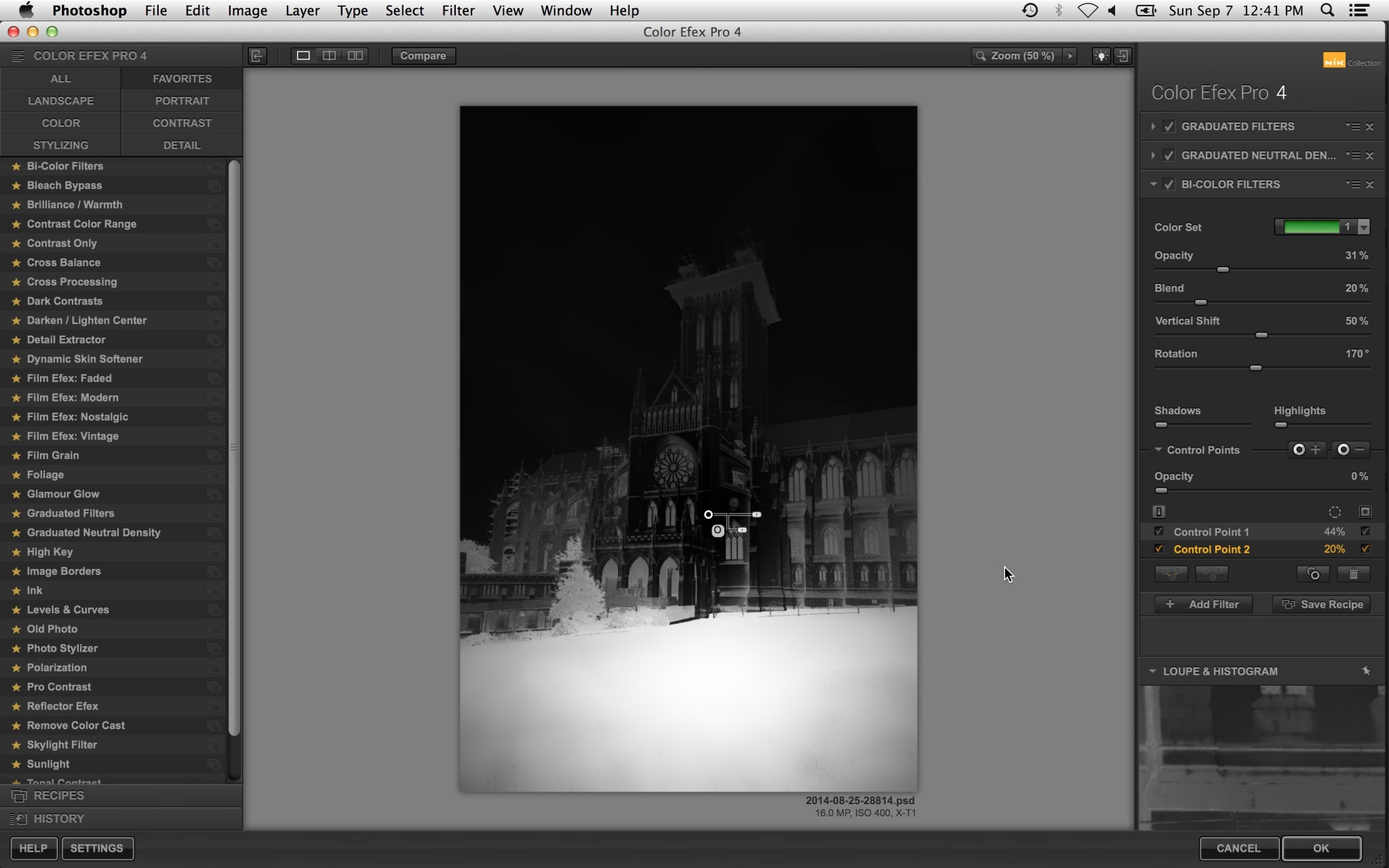 Switching to mask mode shows that only the grass will receive this effect. The screen capture doesn’t show it, but there is a second control point on the grass (the white area).
When I toggle out of mask view, I can see the resulting effect:
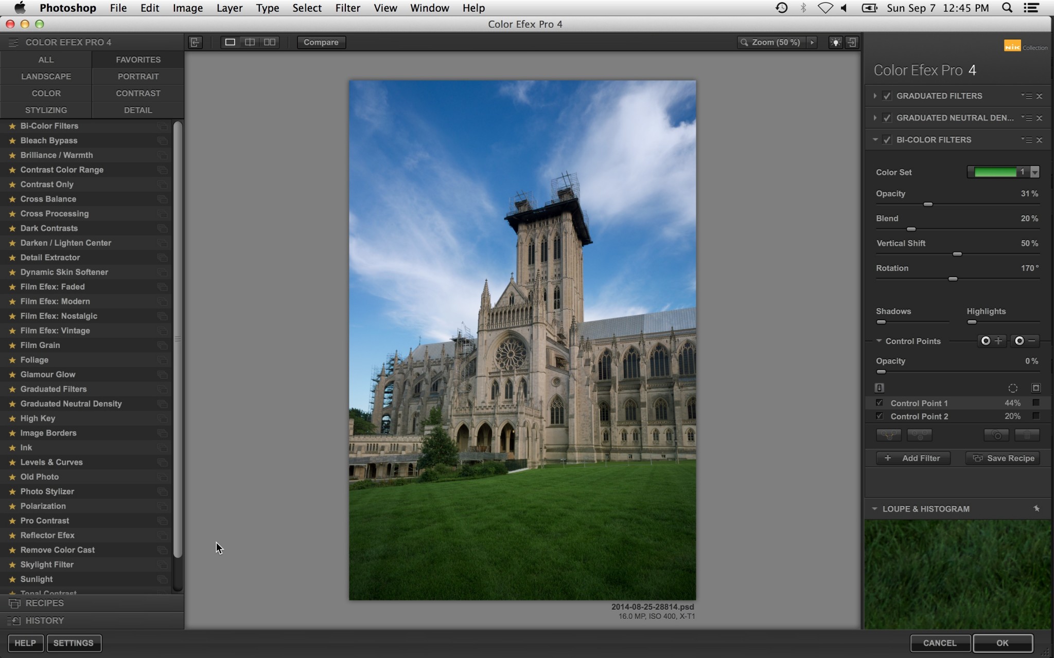 The image after the Bi-Color filter is applied to just the grass.
For the next filter in the stack, I want to warm the cathedral without affecting the foreground too much. I will use Reflector Efex for this, and I will place two subtractive control points in the bottom corners. I will also adjust the opacity sliders on each control point since I don't want to completely remove the effect. Toggling mask mode shows that the control points have the effect of merely taming the filter in the corners:
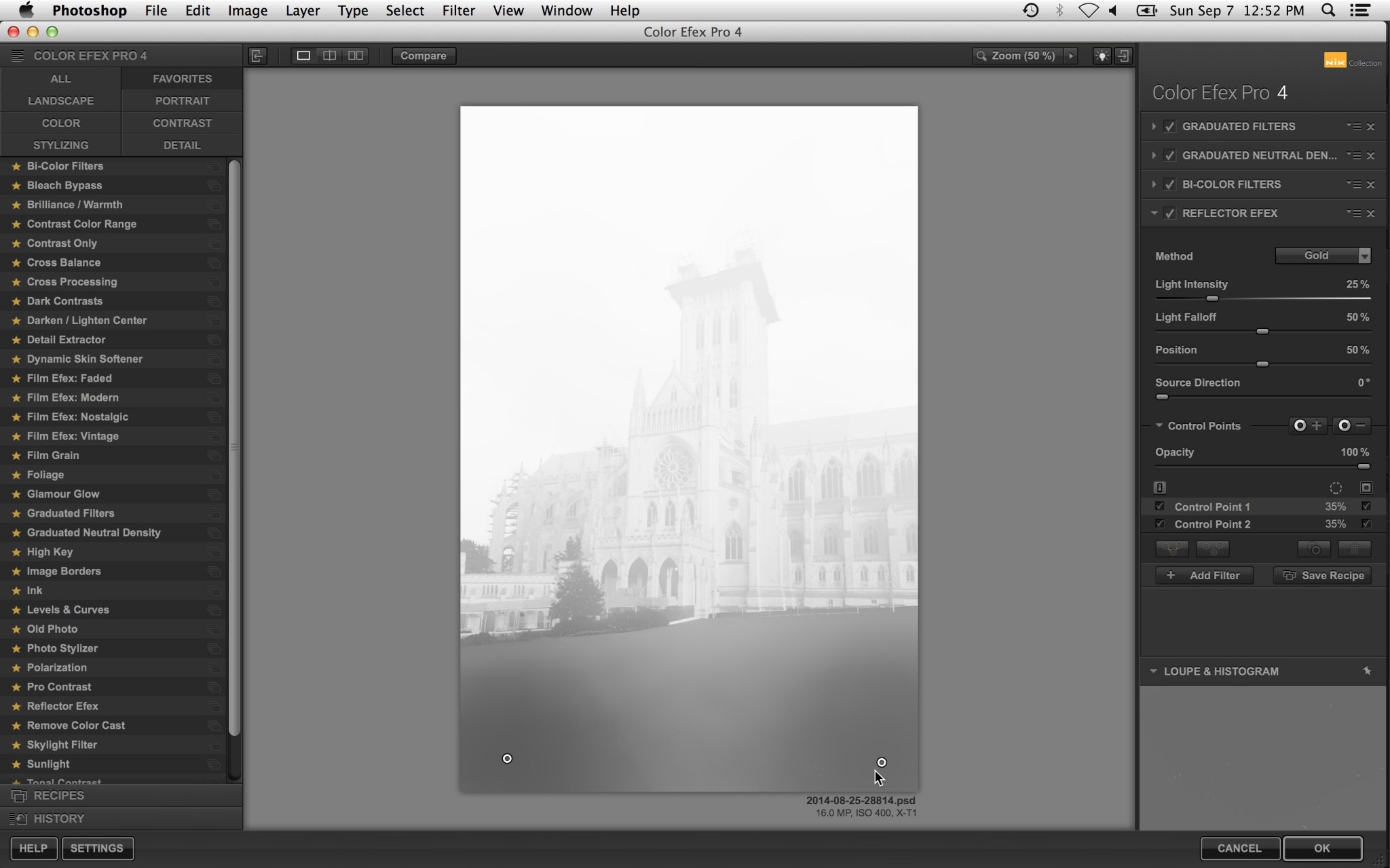 I used Reflector Efex to brighten the cathedral, but I also used two control points to prevent this filter from affecting the lower corners too much. Doing this helps push the viewers eye up and away from the bottom of the image.
Now that the brightness and relative color has been corrected, I want to apply some contrast correction. The easiest way to do this is to use the Pro Contrast filter. Once again, I will use subtractive control points to remove the effect from the sky and the bottom corners. (I'm removing the effect from these areas because Pro Contrast also makes these areas too dark in the process of adding contrast.) Toggling mask mode shows where I added the effect:
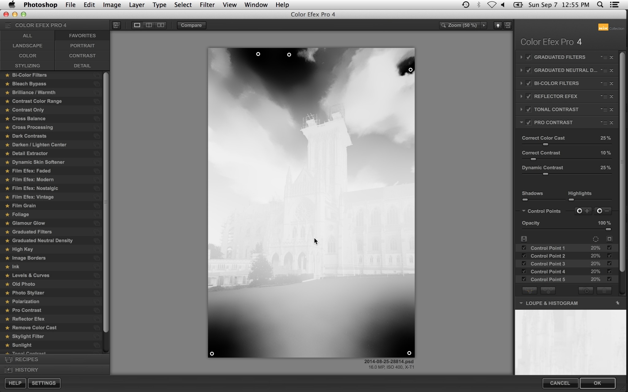 Pro Contrast is a great filter for increasing contrast. However, increased contrast usually draws in the viewer’s eye, and I do not want the viewer looking in the darkened areas as shown in mask view. To solve this, I added subtractive control points up top and down below to prevent these areas from gaining contrast.
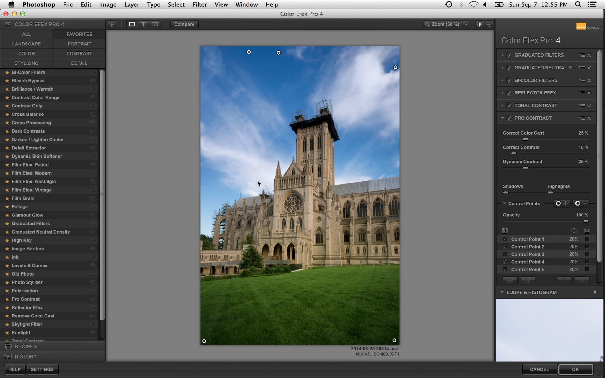 The workspace after Pro Contrast and some control points are applied.
To finish this image, I will add a modest amount of Darken/Lighten Center to, once again, draw the viewer's eye toward the cathedral. I will not use any control points for this step.
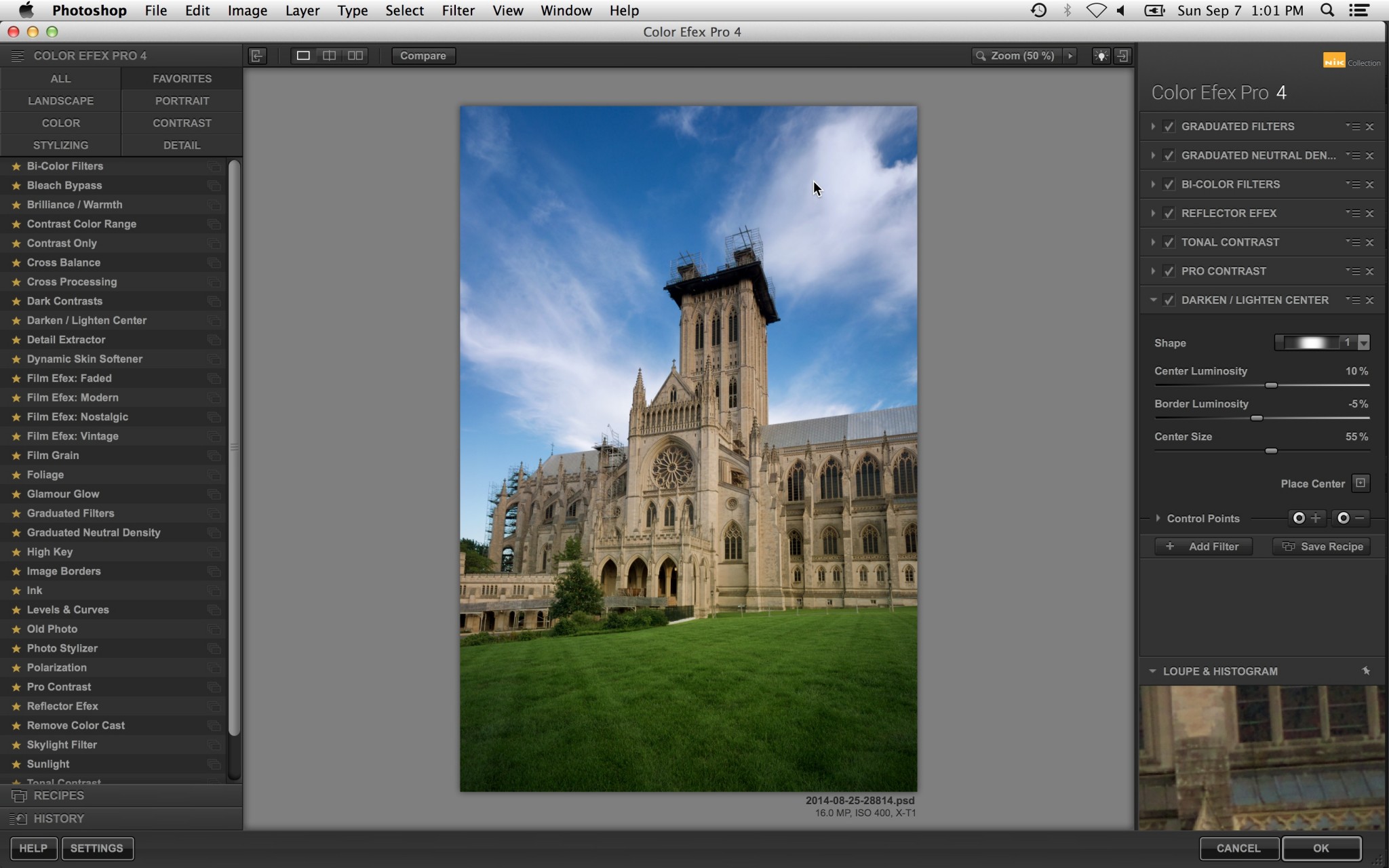 As a final step, I applied a very small amount of Darken/Lighten Center.
The final before and after is shown below:
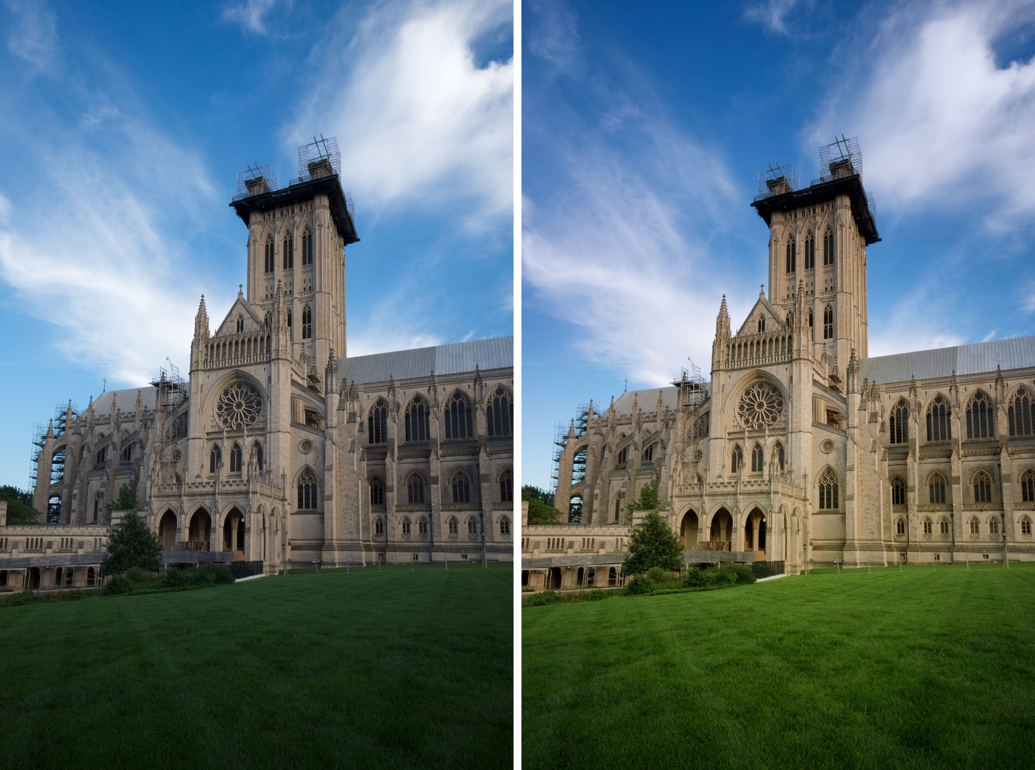 Left: The original image. Right: The same image, after our CEP filter stack is applied. Note that using CEP with control points helped achieve the objective of more saturated colors that help guide the viewer through the composition.
Conclusion
As I've shown, control points are useful for two reasons: First, they allow us to target filter effects towards specific portions of the image. Second, they allow us to use some of CEP's filters in ways for which they weren't perhaps intended. All of this is made possible by the fact that control points are essentially smart, context-aware masks, which can significantly streamline the editing process.
In coming articles, I will highlight some of my favorite filters along with some ideas for speeding up the CEP workflow.

Comments
on September 11, 2014 - 3:14am
Dave,
Nice. I’ve been using CEP for some time now and I’m very comfortable with control points and filter stacking but still I picked up a few new nuances. I look forward to more of your tips. Keep them coming! Cheers.
Florian
Florian Cortese
www.fotosbyflorian.com
on September 11, 2014 - 10:25am
Great article Dave. Keep the tips coming.
Regards, Barry
on September 11, 2014 - 3:19am
This is a stellar tip, and one of the best write-ups on Nik's plugins I've seen. Well done Dave!
@PhotoJoseph
— Have you signed up for the mailing list?
on January 17, 2018 - 9:45am
Thank you for the tutorial: the best I’ve read. Furthermore, it is a step-by-step spot-on, with a useful and significant example, that allow people to perform the same ops at their own pace. I really cannot stand video tutorials, where the presenter often speaks too much, with useless details, and forces the user to continuously pause and play. Thanks!
I have only one question for you: can you comment a bit more on ‘subtractive’ control points?