You are here

Tips

Reclaim the Legacy Highlights & Shadows Adjustment in Aperture 3.3

PhotoJoseph's picture
June 13, 2012 - 9:00am

There’s a lot of fuss over the loss of the advanced adjustments in the Highlights & Shadows tool. Keep in mind, these aren’t features that were dropped — this is a modification of the tool where the new Mid Contrast slider combines “several advanced tools”, according to Apple. I’m trying to find an image that I can enhance with better results using the old Aperture vs the new one, and so far I can’t. Regardless…

Want the old Highlights & Shadows adjustment tool back?

If you want the legacy adjustment tool back, it’s actually still in Aperture… it has to be, otherwise all your previously edited photos would have to be re-rendered, and that’d be a Bad Thing™. If you open pre-3.3-adjusted photo that had Highlights & Shadows applied to it, then you will see the old adjustment tool, with a new “Upgrade” button in place.
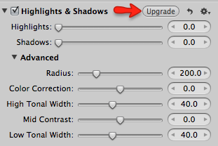
Here’s what the legacy Highlights & Shadows tool looks like in the new Aperture 3.3

Turns out you can save that old adjustment as a preset (set to zero even), and then add that to any new photo.

Keep reading to see how to save a preset, or even download a pre made one!

Share

Auto Enhance and Auto White Balance in Aperture 3.3

Thomas Boyd's picture
June 13, 2012 - 1:01am

I went stumbling through my Aperture library and found a photo that I remembered having a hard time adjusting due to the poor conditions it was shot in. I found the perfect example. It was outside a motorcycle show here in Portland. It was dark, rainy, and lit only by yellow street lights. I can’t get much worse.

I remember fiddling with the white balance and the shadow slider for way too long before settling on a what I thought would be the best I could get.

So, I took that same photo, duplicated the version, and set it to “Revert to Original”. I then clicked “Auto Enhance” and Auto White Balance on the Natural Gray setting. That’s it…two clicks.

It’s came really close to what I spent at least 15 minutes doing. In fact, I think I could make the argument it’s better and more natural looking. 

I’m going to make a bold statement here, ready, here it comes: You are a fool if you don’t first try Auto Enhance and then Auto White Balance. The more difficult the photo, the more important is to try it first. It’s a simple fact that those two simple clicks of the mouse may just save you massive amounts of time. And, if you don’t abide, it’s a simple command-z undo. No harm done.

One note: When I set the auto white balance mode to Natural Gray, it switched automatically to Temperature and Tint. It’s possible to switch it back after hitting the button and you do get different results. I suspect it’s seeing the numbers and choosing what it believes to be the best option. 

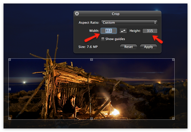
No adjustments except crop


Click through to see the two improved versions…
Share

More Interface Changes in Aperture 3.3

PhotoJoseph's picture
June 12, 2012 - 10:00pm

There’s been a lot of chatter about the updated monochromatic interface, or UI, in Aperture 3.3. I’ve seen a few people who like it, but most aren’t impressed. It’s true that removing all colors from the UI leads to a less distracting interface, which is generally good all around, however it may make it harder to find certain items at a glance.

Share

This was a special Q&A session, where I responded to requests of “What’s your approach to creative image processing”, “Can you show all aspects of printing and soft proofing”, as well as “How do you move from Managed to Referenced”?

Duration: 01:30 hr
Included with membership
Share

Aperture 3.3 Explored

Live Training Session 021

This is a different session than normal, as we took on a live panel to discuss and explore Aperture 3.3 together. It’s over two hours long, and is the first deep look at the new features in Aperture 3.3.

Duration: 02:08 hr
Included with membership
Share

A Quick Look at Some of the Changes in the Adjustment Panel

Thomas Boyd's picture
June 12, 2012 - 5:58am

Take a look at some obvious changes in the adjustment bricks:

The most obvious is the new Professional Auto Enhance button. This is the single most significant change to the way will start adjusting images. I can’t imagine very many situation where you wouldn’t want to start there, just to see what it does. If it looks good, move on! Next!

Brushable white balance opens a lot of creative possibilities.

Share

Pages

You may login with either your assigned username or your e-mail address.
Passwords are case-sensitive - Forgot your password?
randomness