Using the Fonts Window to Customize Text in Aperture Books
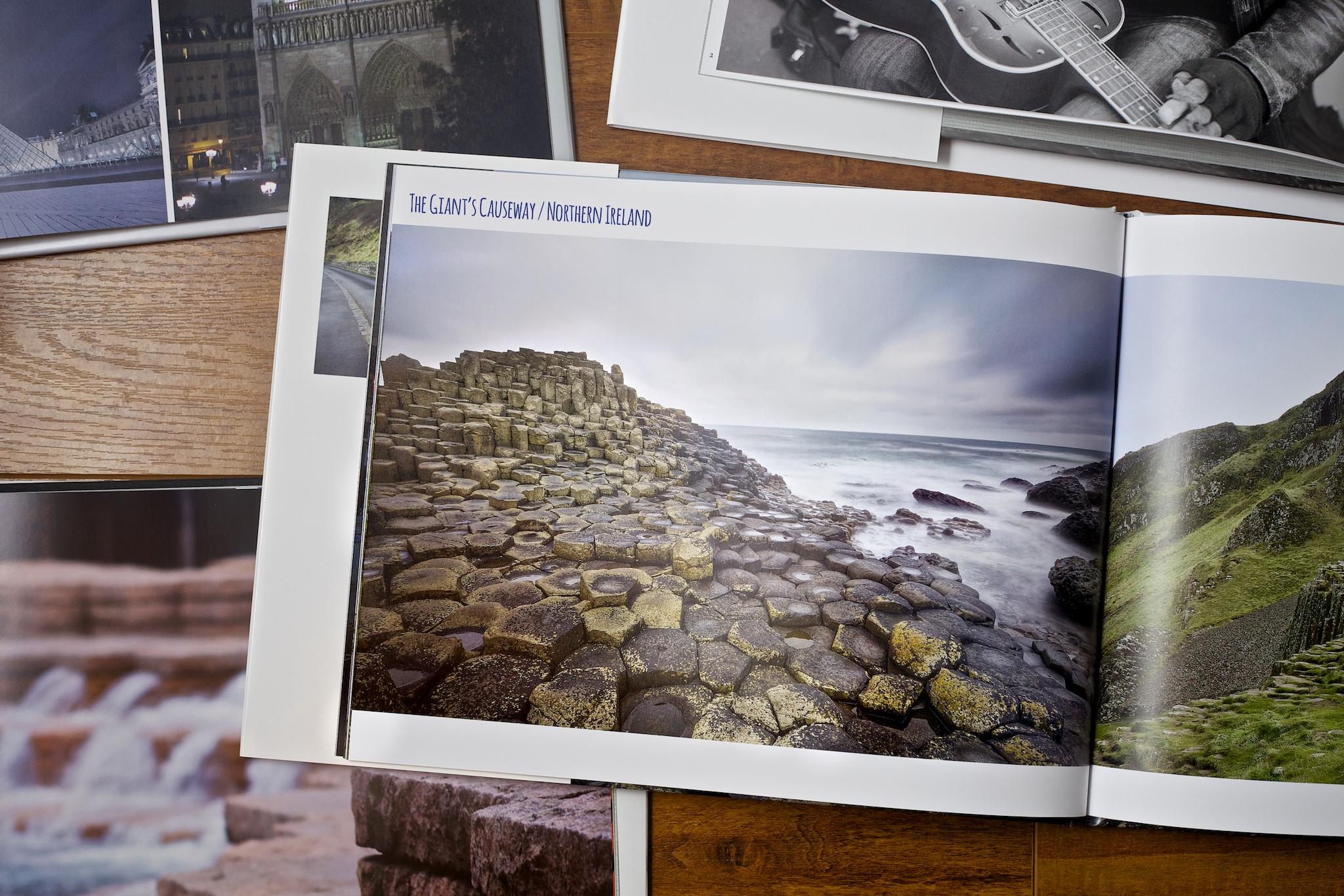 Books created in Aperture
Creating books in Aperture is a great feature and can be used for a lot of different purposes. You can use the book making tool to create printed portfolios of your work, a proof book for your clients, or my personal favorite, a photo album from your travels. Whenever I get done editing the images from a trip, my favorite next step is sorting through my best and favorite images and laying them out into a book. It is a great memory to keep for yourself and will also make an amazing gift to give to your friends and travel companions.
Using the Fonts Window to Polish Off Your Book Layout
Creating books is really easy and straightforward with the book making tool in Aperture. I love that all the tools I need to make simple and great looking books are available to me right in the same application I use to edit and organize my raw images. You have access to all of the images in your aperture library with only a couple of clicks and placing images into a layout is as simple as drag and drop. Reformatting the layout and position of images and text boxes is also very simple. With all that said, one of the things that I think really adds pizazz to a book design and is hidden away in the File menu, is the ability to customize the fonts for text and titles. The built-in fonts available in the book templates are often limited and generic. By customizing the font of a title or text box, you can enhance the design and use the text to supplement the mood of the images in your photo book.
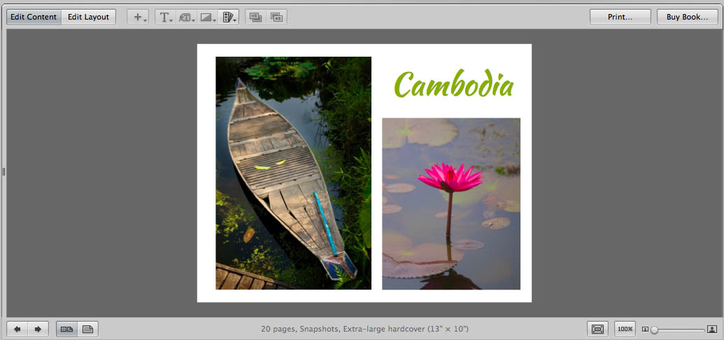 A book cover with a new stylized font applied
The process of changing the size, style, and color of the font is really easy. Select the text you want to change and then go to “Show Fonts” in the Edit menu (EDIT > SHOW FONTS). To speed up the process you can also use the keyboard shortcut Command+T. The Fonts window will appear on the screen giving you access to a number of styling options and all of the fonts available on your machine. By default, your Mac already has a variety of fonts installed, but you can also download additional fronts from the internet which may work really well for your book layout. The image above of my Cambodia book has a custom font I found online at Font Squirrel that reminded me of some of the signage I saw while traveling there.
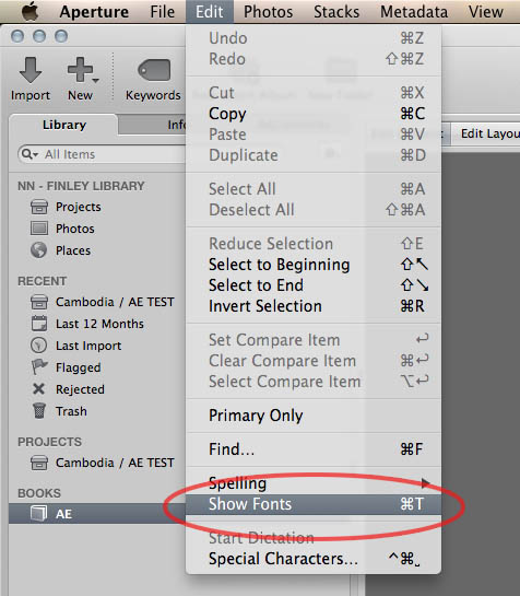 Accessing the Fonts window from the menu
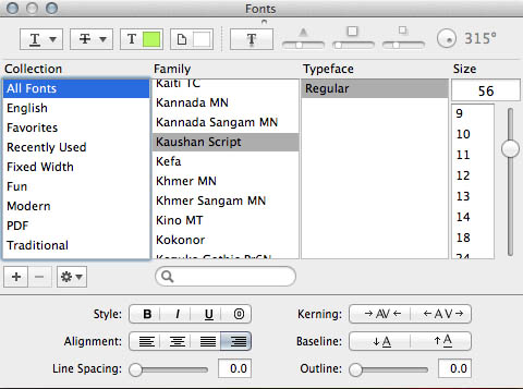 In the Fonts window you can adjust a variety of style options
I have used this technique multiple times and have had great results. I personally have ordered books from Apple's Print Services that have custom fonts and styling and they have all printed with no problem. When you are ordering your books please make sure to preview the book from the Buy Book order screen. This will create a PDF file similar to the one sent to the print shop for final production. Any problems seen in the preview will need to be addressed prior to finalizing your book order.
Taking it a Step Further with Master Pages
If you want to use a custom font consistently throughout your book layout, a good way to do this is by applying the styling directly to a Master Page layout template. I do want to warn you about this technique though as I have found this part of the process buggy and at times frustrating. After numerous trials and errors, I have found a few steps that can mitigate some of these frustrations and I have noted them below.
When creating Master Page Layouts with a customized font I have found it best to start with a brand new Master Page instead of modifying an older design. To create a master page, use the Book Actions drop down menu (the button with a gear icon) and select “Show Master Pages.”
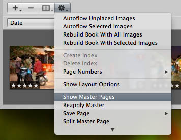 Click here to show the Master Pages
Once you have the Master Pages pane open, you can add a new Master Page by clicking on the “+” button and selecting “Add New Page”. You can now add text boxes and photo boxes. When you are customizing the Master Page, the layout will be available to you in the page chooser drop down menu (as shown below).
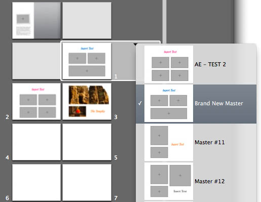 A set of customized templates I can choose from in the page template drop down
Another option I sometimes use to create a new Master Page is by using the “Save Page > As New Document Master” feature from the Book Actions drop down menu. This feature will take a page you edited and stylized, creating a Master Page template that matches the design. The one bug I consistently come across when using this method is the text is almost always reset to a default generic styling. To get the stylized text, you will then need to reapply the font styling to that actual Master Page.
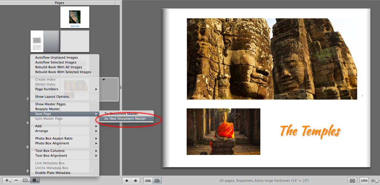 I liked this layout so I saved it as a new Master Page
Another bug I frequently deal with happens when I choose one of my customized master page layouts from the template chooser. Aperture will sometimes reset the font styling of the text back to a generic default. To further explain this issue I will use the following example: If I select the “Brand New Master” layout in the image above I would expect the text to be blue, italic, and a script font. When the bug happens, and from my experience, the text will be a boring generic font. After trial and error I have learned that if I switch to a blank page layout prior to setting my desired custom layout, it will maintain the stylized text as I wanted. It's an extra step and you lose any of the images you may have placed in the page but it is work around. I hope this bug will be fixed in a future update.
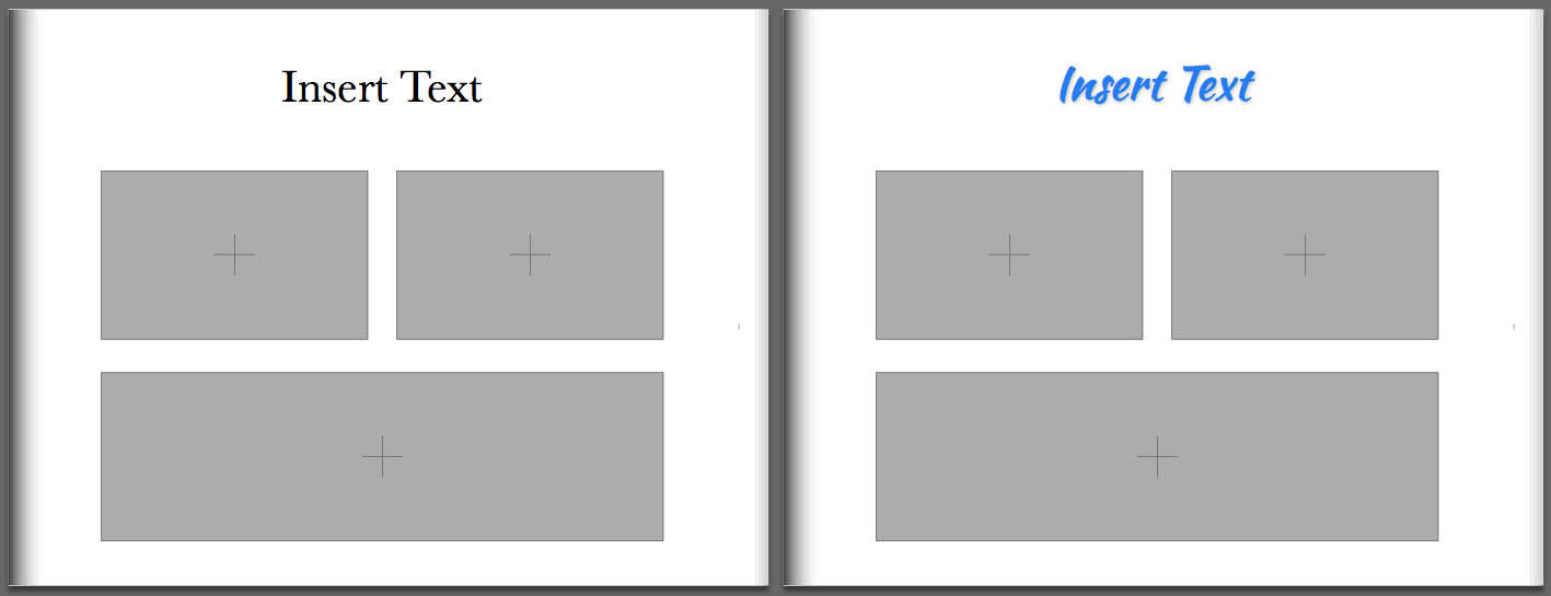 The bug reset the text on the left page - On the right I started with a blank page so the text set correctly
Conclusion
I hope this pushes you to give book-making a try. I have received a number of books created in Aperture which were printed through Apple and all of them have fully met my expectations in terms of print quality and finish. By incorporating fonts and styles that match the theme of your images, it really adds that extra bit of polish to your book that can set it apart and make it stand out to your clients, friends, and family. On top of that, they offer an amazing keepsake to remember your travels and experiences.

Comments
on July 23, 2014 - 11:40pm
Nick
Your timing is perfect as I am just in the process of editing some photographs for a book as a gift. Two weeks ago I was very lucky to be taken to my first air show Royal International Air Tattoo and as a thank you I am creating a book out of my favourite shots.
If you would like and have time I would love a pros critique of some of my shots or anyone else reading this post. You can find them here http://thepetphotographer.me/other-stuff/
Cheers for the post
G
on July 24, 2014 - 5:11pm
Graham, I'm glad the timing was good for you. That will make a thank you gift. Shoot me an email and I would love to give your work my opinions. nick at nicknieto.com
www.nicknieto.com / Portland, Oregon
on July 29, 2014 - 11:46am
Hi Nick,
Thanks for your explanations. I had A LOT of frustrations when I realized my first Aperture Book last year with an sophisticated own layout, and most of the frustrations were linked to font handling.
In addition to the problems you describe (which I also suffered from) I found two other big bugs and I am wondering if you know them:
(1) Dealing with special typography features (open type)
If you use open type fonts with their special features you can address them within Aperture by opening “show fonts”, clicking the action pop-up menu and then choosing the entry “typography”. In my book I used a font supporting “Old-Style-figures” which can be selected under the entry “number case”. And here is the bug: Aperture loses this kind of formatting if you go on working on the book or just leave and restart Aperture.
Result: If you use one of those sophisticated font features and want to print or order a book, you first have to go through all of your text boxes to re-adjust formatting.
(2) The link in meta data boxes are unexpectedly disconnected after assigning a font
I created index pages in my book to show some meta data of the images. This is a comfortable function of Aperture as the meta data box is linked to the corresponding image and reordering the images in the index will always show the right meta data. The bug: assigning any other font to the text box immediately unlinks the meta data box.
Result: If you ever format the meta data boxes in an index page you have to re-format and re-connect every single text box. Fortunately I only assigned one meta data box to every of the 108 images but still it was a hell of work to re-format.
My thoughts and more problems with Aperture books
I was in intensive discussions with Apple support concerning these and other problems I had printing my books. Nobody (even in the enterprise support crew) knew about these bugs. The bugs were routed to the developers without any feedback however. My assumption is that the whole font management is badly implemented into Aperture.
Other problems I had with book production:
Future
As Aperture is dead and as I don’t expect Photo to incorporate the book-layout-features Aperture offered we probably will lose a great though buggy tool for creating books with totally individual layout options :-(
Best regards
Holger
on July 30, 2014 - 5:18pm
Holger,
Aperture books is without a doubt buggy as both of our experiences have shown. I don't use the metadata boxes very often because I've had such a bad experience with it.
I'll have to see if I can research that issue you had with the figurines and see what if I can find a solution.
I'm sorry to hear about your issues with Sharpening. I haven't really had that much issue with it. Most of the time when you deal with paper prints the paper will soften the print a tad so for the extra sharpening usually works fine for me. I guess my recommendation is to try and take the image in Aperture to the point where the sharpening looks perfect and then back it off slightly that way it will balance out for you.
I had a thought about losing some of the book making tools advanced options. Both Photos and Yosemite as a whole have been touted to having expand-ability with extensions. Let's say Aperture books doesn't have all the features we want. Someone like Blurb could use this new access to the architecture and build a more advanced tool that could work with photos. Just an idea. Who knows how this stuff pans out but that could be one way the more advanced users get their books fix with photos.
www.nicknieto.com / Portland, Oregon
on July 30, 2014 - 4:05pm
I am hoping books come over with Photos. Books (and other printables) are in iPhoto now, and I can’t imagine that going away in Photos.
But thanks for posting more about the Aperture books. I’ve created/purchased them a number of times and like them the best for quality+ease. So ANY content we can get on how to improve the development process would be greatly appreciated. It’s surprisingly how little content exists on the Web for Aperture books!
Side note: I discovered that if I filtered my vacation photos at the end of each day, selected 20-50 that I liked, quickly processed them (nothing major) and then laid out the basic pages and (most importantly) text description of the day, then by the time I got home, my vacation book was almost ready to upload/buy. Last year’s vacation was done all at the end after the trip and it was a nightmare! Both years, I ended up with a 200 page book, but this year was fun and I was able to adjust the next day’s shooting activities to get shots I missed or realized I wanted as I was building the book. Never felt “overwhelmed” like I did when I created from the final pile of photos back home.
on July 30, 2014 - 4:39pm
Jake, I agree I can't imagine Apple getting rid of printable products. The level of infrastructure and partnerships they have in place would be quite a lot to dissolve on something that I would think is a continual revenue generating process. My guess is books will still be available in some way in photos probably closer to the iPhoto implementation than the aperture. Only time will tell.
Handling the layout day by day seems like a good way to handle it. I will give that a shot during my next trip. I don't typically do a ton of editing while traveling but I do keyword and rate my images as picks and could do basic layouts while on the road for sure. Thanks for the info
www.nicknieto.com / Portland, Oregon
on July 30, 2014 - 4:57pm
Here’s the trick to making the “daily editing” process work: You have to remember it’s a vacation/personal project, not a client shoot. I love the book we ended up with, nearly as much as the one I did for last year’s vacation. But I literally put in 60% less effort and got 10% less “quality” result. In this case, at least in this particular destination, I’m fine with that. At least for the book purposes. I may go back later and really bang on some particular photos for whatever reason, but the no-stress approach to vacation/family book making is vastly worth the slight reduction in quality. (A reduction, by the way, that only I would notice. Everyone else loves the book and wouldn’t be able to pick out a single difference between the two years if challenged to do so. I know I would, but I’m “A Photographer”. We’re weird!)
on July 30, 2014 - 5:02pm
@jake
I’m sure Photo will include books again. HOWEVER the special feature of Aperture is the ability to create and modify layouts with a great degree of freedom, something that is impossible to do in iPhoto.
Congratulation to your workflow concerning your vacation photos!
Holger
on July 30, 2014 - 4:06pm
Holger - have you found a better alternative? Sounds like you’ve throughly researched this and I’d love to hear if you’ve found a “good” solution.
Thanks!
on July 30, 2014 - 5:12pm
@jake
No, I did not find a solution better than Aperture. However, my pre-condition was to create the book within the same application I use to organize and edit my images. This left iPhoto (see comment above) and Lightroom. At time of my research Lightroom did not enable to me to create the layout I wanted, maybe this hat changed with the newer versions.
I would never create my book with a separate application due to the resulting cumbersome workflow. The necessity to many adjustments (crop, brightness, contrast) will only become obvious seeing the arrangement of the images within the book.
Holger